How to use the Performance tile

The Performance tile enables you to view a wide range of visualizations using performance data from the SCOM Data Warehouse.
Dashboard Server accesses the Data Warehouse directly using the published schema, so must have a Data Warehouse connection (see How to check and reconfigure the Data Warehouse connection) with the correct permissions for Performance graphs to work.
Performance tiles can be added to both dashboards and perspectives.
This short (2 min) video gives you and overview of performance reporting features, including using the page timeframe, aggregation and resolution options, drilldown to a full page graph, compare to other objects/groups and export to Excel (Export to Excel).
How to configure a Performance tile
The following steps guide you through configuring all visualizations except the Report, since configuring a Performance Report works a little bit differently. If you want to configure a Report jump to How to configure a Performance tile Report.
Add a new tile to a dashboard or perspective and choose the Performance tile.

Select the visualization for your Performance tile and click next.

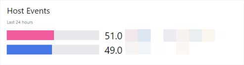
 Bar Top N
Uses the latest data to compare data, such as the top or bottom ranking metrics in descending or ascending order, as 'Top N'.
Visualizes both a number and the resulting bar width based on the number value.
Example:
 Heatmap
Displays a metric value as a color shade.

Jump to Walkthrough: Adding a Line Graph to show % Processor Time..
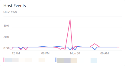
 Line Graph
Shows data over time, in a graph with an x-axis (time) and a y-axis. You can show several objects, such as servers, in one graph.
Example:
Jump to Walkthrough: Adding a Line Graph to show % Processor Time..
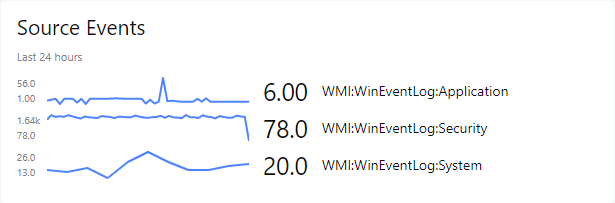
 Sparklines
Shows data over time (like line graphs), but each item gets its own graph instead of showing all lines in one graph.
Example:
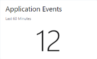
 Scalar
A single value such as a number of customers or incidents.
Example:

Scope:
The scope allows you to define which objects are shown, which in turn determines which metrics are available.
Note for using the group or advanced option:
By default the scope of Performance tiles will look at multiple levels of membership (recursive search) for objects, so they will look at multiple-levels of membership rather than just one level. This means the tile shows data for objects that aren't directly contained in a group, but are contained within other objects. For example, this allows you to find disk metrics when scoped to a server.
If the scoped group contains only subgroups and you have not specified a class, then no metrics will be available in the metrics drop down list. By specifying a group AND a class it means that you can extend this recursive search to use top-level groups to show graph data for objects within sub-groups (as well as objects).
To enable recursive searching to work for sub-groups you should specify a group AND a class in the advanced scope option. This will allow the dropdown list to show the metrics for the objects in the sub-groups.
Note for choosing a class:
Choose your class carefully as for a Performance tile this will determine which metrics are available in the Metric panel.
Note for Scalars:
The Scalar visualization should be scoped to only one
object using the list option, as only one figure is shown. Do not use agroup .Scope options on dashboardsTip: If you experience any problems with scoping tiles, you'll find FAQs and help in the article How to scope tiles.
List List allows you to select one or more objects or groups.
You can add multiple
objects and groups . To remove anobject or group click the x to the right of its name.Tip: Start typing and after two characters you'll see suggestions that match the name appear.
Tips for using wildcards when searching for objects or groupsBy default searching will look for the top 10 items containing the words listed in the search. If you wish to create a more specific search you will need to use wildcards (*).
If you place a wildcard after the term you are looking for, it will find all the objects which start with that word searched and any terms that may follow. If you place a wildcard at the start of the search term, it will look for objects that contain the searched word and also have terms before that word.
If you enclose your searched term in wildcards it will look for objects which contain the searched word, this object will not begin or end with the term searched.
Group Group allows you to select members of a specific group. Only one group can be selected.
Advanced Advanced allows you to select a group, class or both. You must at least define either a group or class. You can define both. You can also use criteria to narrow down your selection.
Group:
Same as the group option above.
Class:
Class equates to the target class within SCOM. As you type the dropdown will be populated with suggestions of matching classes from SCOM, from which you can select the required class.
Criteria:
Criteria allows you to create an expression to further refine the scope.
Examples for commonly used criteriaObjects you would like to see Criteria Objects with particular text in their name DisplayName like '%Server1%'Objects starting with a particular string DisplayName like 'test%'All objects in maintenance mode InMaintenanceMode = 'TRUE'Only healthy objects HealthState = 1Objects with a health state in SCOM of 0, an unknown health state (uninitialized), a gray health state icon with a question mark. HealthState = 0Objects that are not healthy HealthState != 1Objects in critical state HealthState = 3Objects in critical or warning state HealthState = 2 or HealthState = 3To show all gray uninitialised objects HealthState = 0 OR HealthState IS NULLAll objects not in maintenance mode InMaintenanceMode != 'TRUE'Objects where the parent agent is offline IsAvailable='false'Objects that are offline, in maintenance or state unknown IsAvailable='false' OR InMaintenanceMode=1 OR HealthState=0Computers with a particular OS OSVersion = '6.3.9600'List objects by name and filter by HealthState (Name like '%Server3%' OR Name like '%Server4%' OR Name like '%Server2%') AND HealthState=3List objects by SCOM Id and filter by HealthState Id IN ('7021174b-9e5d-5fbf-878a-42b9f0bf6f4a', '9bd4a1cc-f07a-0e36-b37d-d9ee974e0f3c') AND HealthState=3Exclude object from the Group specified DisplayName not like '%server3%'Exclude objects from the Group specified (DisplayName NOT LIKE '%server3%') AND (DisplayName NOT LIKE '%server4%')For more information see:
Scope options on perspectivesNote: If you never used a perspective, you should read Working with perspectives before scoping tiles on perspectives.
The power of perspectives is that tiles on a perspective can use a dynamic scope. A dynamic scope considers the currently viewed
object . A dynamic scope consists of two different states:the configuration of the scope in the tile (for example, "consider child objects of type logical disk for the currently viewed object")
the actual resolved scope that depends on which
object you are currently viewing ("this object has 5 child objects of type logical disk")
After configuring the dynamic scope once in the tile, you'll get different results depending how the scope is resolved on the different
objects you are viewing.Suggestions
Suggestions are generated based on the object you are currently viewing. You'll see a list of relevant scope options based on the object's relations to other objects. Suggestions don't cover every possible scope, but they are a quick and easy way to select a suitable scope for your tile.
Note: Suggestions won't be shown if an object has no children, parents or siblings.
Tip: If the exact scope you want isn't listed in the suggestions, you can select a suggested scope that is similar to the one you want, and then click on custom. The custom section will now automatically be filled with the suggestion you picked and you can edit the scope here to adjust it exactly to your needs. This is a more intuitive way to pick a scope than starting in the custom section and navigating the SCOM object model for classes and groups.
Double-check the scope when using suggestions: Using suggestions is an easy way to pick a scope, but you need to make sure that the generated suggestion is appropriate for all objects that use the perspective.
For example, when you pick a suggestion for an EA, you will get suggestions that are specific to the map, dependencies, and availability tests for this one EA. On perspectives you want to use for all EAs, you have to change the scope suggestion in the custom section so that the tile work for all EAs.Walkthrough: Editing a scope suggestion to make it work for all EAsEnterprise Applications are designed so that you can map out the servers that make up the application. You can then configure tiles to show information related to just the servers on the EA's map. When you create a perspective that will be used for all EAs, you need to make sure that you scope the tiles so that they work for any EA. When you start with a suggestion, the tile's scope only works for the one EA you're currently looking at, and this is why you need to edit the scope:
For an EA you want to scope to the servers that are specified on the EA map by selecting something from the suggestions (Dashboard Server 4.2 and above) that shows something similar to the following:
This /<YourApplicationName> Map / ... / Windows ComputerThe above will scope the tile to all the objects of class Windows Computer on this EAs map.
The screenshot below shows some scope suggestions for an application called FinanceXS. The bold text shows the currently selected scope is This object. The cursor shows the option
This / FinanceXS / ... / Windows Computer. Once chosen this scope will show all the Windows computers shown on the applications map.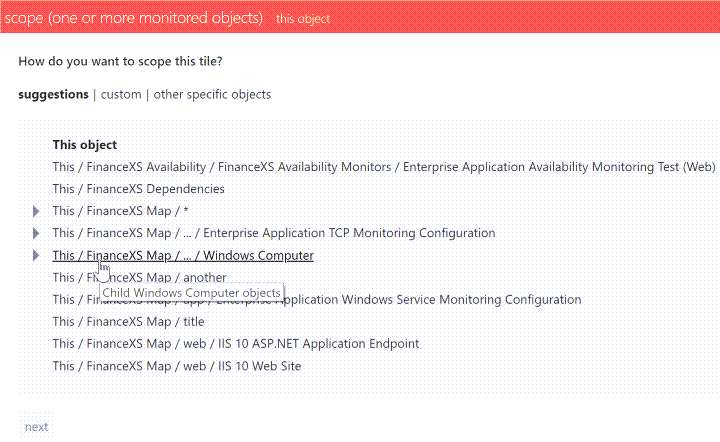
Next, we need to adjust the specified scope to allow it to work for all EAs, rather than just this one.
- In the scope section click custom.
Click on the text
<YourApplicationName> Map (children)which is your first scope step. This will expand the scope step so you can edit it.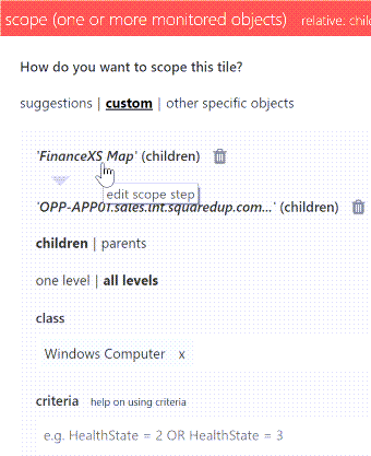
Remove the auto-populated class
<YourApplicationName> Mapby clicking the cross x next to it.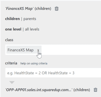
Start typing
Enterprise Application - Mapand select this from the list to add this class. This is so that this tile scope will work for all EAs, rather than just this one EA.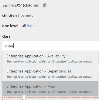
- The scope is now configured to show all the Windows computers on the EA's map, whichever EA you happen to be viewing with the perspective.
How to read the suggestionsYou can pick between "this object" and objects that are related to this object as parents, children or siblings. The suggestions for children are written as paths that follow the SCOM object tree structure, parents and siblings can be identified by the word parent or sibling in the suggestion.
A parent of an object is any object that hosts or contains that object.
A child of an object is any object that this object hosts or contains.
A sibling of an object is any object of the same class that is hosted by the same parent.This object The dynamic scope will be resolved to the object currently viewed.
"this object" option which does NOT mean the actual one object like for the target setting but the relative object I'm looking at
This / child/child/class of objectThe dynamic scope will be resolved to children of the object currently viewed.
You select objects of a particular class that are contained in path. The class of the objects you are selecting is stated at the end of the path.
This / * The dynamic scope will be resolved to children of the object currently viewed.
If a path ends with a wildcard (*) it means that you select all objects of any class within the path.
Technically it means that we fill the class field with the class "logical entity" since every object in SCOM has this class, it is a "base" class
Example:
This / IIS Web Server / *selects all objects of any class in the level belowThis / IIS Web Server.This / child/ ... /class of objectThe dynamic scope will be resolved to children of the object currently viewed.
If a path contains an ellipsis (...) it means that you select objects of a particular class that are contained in all of the objects that are contained in the path preceding the ellipsis. The class of the objects you are selecting is stated at the end of the path.
Example:
This / Sales App Map / ... / Windows Computerselects all objects of the class Windows Computer in theThis / Sales App Mappath.Parent class of objectThe dynamic scope will be resolved to parents of the object currently viewed. Sibling class of objectThe dynamic scope will be resolved to siblings of the object currently viewed. Show more triangle next to a suggestion
You can click the show more triangle to expand the list of suggestions and see more specific paths.Example for navigating suggestions in an EAIf you are looking at an EA, the path to find all windows computers in that EA may read
Map / ... / Windows Computer. It returns all objects of the Windows Computer class contained within all of the paths underMap.To narrow the scope down, you can click on the triangle to expand the suggestion and select one of the more specific paths. If you select
Map / Web / Windows Computeryou will find all objects of the Windows Computer class in the pathMap / Web.If you choose the option
Map / *you'll find all objects contained in the map. If you extend this suggestion by clicking on the triangle, you'll see suggestions to select all objects in a more specific path, for exampleMap / Web / *.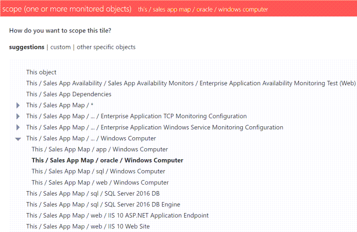
Custom
Here you can pick objects that are related to the object you are currently looking at. If you want to create a specific scope that is not listed under suggestions, you can create the scope here.
Tip: You can pick a similar scope under suggestions first and then click on custom to edit it.
How to pick a simple relation (one step through the SCOM model)At the top, you'll see the name of the object you are currently looking at. Now you can choose if you want to pick parents or children of that object, and if this parent or child relation should be considered only one level up or down the SCOM model or through all levels.
Class:
Here you pick the class of the objects you want to select. If you leave this field empty, the scope falls back to the "this object" scope.
Note: You will only see groups and classes that the object you are currently looking at is a member of.
Tip: If you want to pick objects of any class, enter the SCOM base class logical entity in the class field.
Tip: If you want to find out what classes the object you are interested in belongs to, you can go to the Monitored Entity perspective of that object. You'll see all the classes the object belongs to listed there.
Criteria:
You can narrow the selection of objects of a particular class down further by entering criteria for those objects. For more help see How to use criteria when scoping objects.
Tip: If you want to find out what properties you can base your criteria on, you can go to the Monitored Entity perspective of the object you are interested in. You'll see all the properties for criteria listed there.
.
Example for picking a simple relationFor example, for a perspective created for the group IIS8 Computer Group adding a Status tile scoped to show children with a class of
objectwill show the group members, i.e. the members of the IIS8 Computer Group.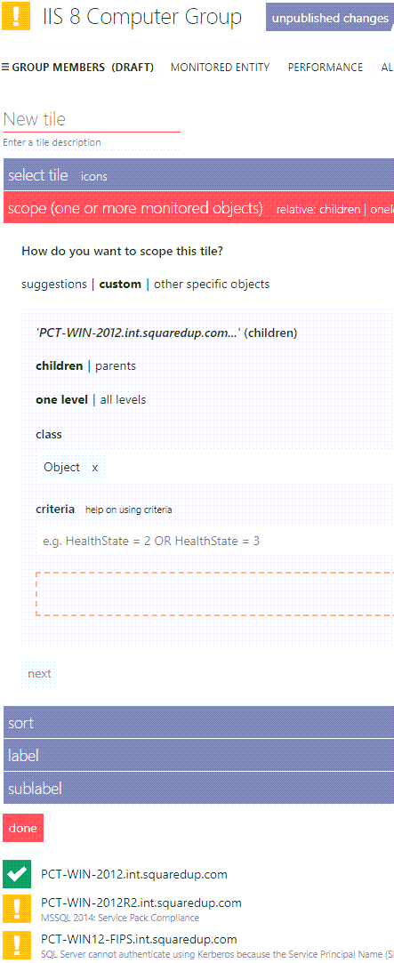 How to pick advanced relations (multiple steps through the SCOM model)
If you need to traverse a more advanced SCOM object model like an EA, you can use the + button to add more steps. This creates a scope that can go through any kind of path of the SCOM object model.
Complete the following steps and then click the + button after you're done to add the next level of SCOM objects:
At the top, you'll see the name of the object you are currently looking at. Now you can choose if you want to pick parents or children of that object, and if this parent or child relation should be considered only one level up or down the SCOM model or through all levels.
Class:
Here you pick the class of the objects you want to select. If you leave this field empty, the scope falls back to the "this object" scope.
Note: You will only see groups and classes that the object you are currently looking at is a member of.
Tip: If you want to pick objects of any class, enter the SCOM base class logical entity in the class field.
Tip: If you want to find out what classes the object you are interested in belongs to, you can go to the Monitored Entity perspective of that object. You'll see all the classes the object belongs to listed there.
Criteria:
You can narrow the selection of objects of a particular class down further by entering criteria for those objects. For more help see How to use criteria when scoping objects.
Tip: If you want to find out what properties you can base your criteria on, you can go to the Monitored Entity perspective of the object you are interested in. You'll see all the properties for criteria listed there.
.
Other specific objects
Gives you the normal, non-dynamic scope options you are used to when scoping tiles on dashboards. This means the tile will not dynamically adapt it's content to the currently viewed
object , it will always show data for the staticobject picked here.Since the power of perspectives is that their tiles can show data for different
objects depending on whatobject is currently being viewed, you should only select this option when you are sure that there is no relationship between the desired scope and the currently viewedobject .Here you define which value the graph will show. For example, if you want to see the response time of different servers, your metric value would be response time. If you want to see the number of tickets, your metric value would be number (of tickets).
Choosing the metricQuick find:
The drop-down list will show you a list of all metrics available for the scope you have set. Press the down arrow on your keyboard in the choose metric field to see the list.

Advanced:
Allows you to specify the object, counter and/or instance. For example, you can use the quick find to find and select the metric
LogicalDisk - % Free Space, and then click on advanced and specifyC:in the instance box to only view C: drives.
You can also use metric > advanced to show multiple metrics on one graph (How to show multiple metrics on one graph (v4.2 and below)) or use wildcards in metrics (How to use wildcards in metrics).
Choosing the ResolutionDashboard Server uses the highest resolution data available (raw, hourly or daily), based on what data is available in the Data Warehouse for the whole graph time period.
The auto resolution setting (v4.3 and above) automatically changes the resolution to a more suitable resolution when the page timeframe is changed by a user, in order to optimise the time to return the graphs.
The data available in the Data Warehouse is determined by the retention period (see How to optimise the Data Warehouse - 5 Point Plan) set in SCOM. When the retention period for hourly data is set to 180 days and a Dashboard Server graph is set to display 6 months of data, this can actually be 182 or 183 days. Dashboard Server will switch to daily data because hourly data is not available for the full 6 month period, i.e. the retention period is less than the date range. The solution is to modify the retention period to reflect 6 months i.e an extra 5 days and set the retention period to 185 days, this should not affect your storage levels too greatly. After a few days this will resolve the problem because 6 months of hourly data will then be available, when Dashboard Server checks the retention period against the requested time frame, the retention period would be higher and Dashboard Server would show hourly data.
Choosing the aggregate value typeWhen a resolution of hourly or daily is chosen you can select whether you'd like to see the average, minimum or maximum figures for that aggregated time period. For example, for a web transaction you might want to see the maximum or minimum figures rather than the average.
Choosing the metric labelThis allows you to specify that metric label, which is then displayed on the y-axis and hover value.

You should select the label that matches how the the data is being returned, or use the other option to specify a custom metric label, such as pages/sec or count.
Configure the settings for your visualization:
Settings for Bar Top NWhich timeframe does this visualization use?
This visualization always use the latest data and ignores the dynamic page timeframe set by users.
What is the page timeframe?The page timeframe is the timeframe setting a dashboard
or perspective is currently using. When a user changes the page timeframe, all tiles that use the page timeframe will adapt to the new timeframe. Tiles that don't use the dynamic page timeframe aren't affected and won't change.
Settings:
Data Range
The Data Range option allows you to choose the range of data the graph will display. For line graphs, this means the data on the y-axis.
percentage Shows 0 to 100 fit to data Shows the data minimum to data maximum fit to data (from zero) Shows from 0 to the data maximum custom Allows you to specify the min and max custom fit Allows you to specify the min and max limits, so that data outside your settings will not be shown. If all the data falls within your specified ranges then the y-axis range will fit to the data rather than your caps.
Sort
Sort allows you to change the order of the results displayed. You can sort by value (ascending or descending) or label (alphabetically ascending or descending).
Limit number of results:
This option is only available when you sort by values, not by labels.
Here you can define a limit for the number of results you want to see. Activate the limit number of results displayed checkbox to enter a limit for results. You can choose if this limit should be applied from the top ranking results down (ascending, default option) or from the bottom ranking results up (descending).
Label
Allows you to change the label of the results.
auto Choose this option if you want to use the default label that has been created automatically.
custom
Here you can change the label to a custom label. You can use static text and dynamic properties. Use the mustache picker
 to select dynamic properties from the response data to use them as labels.
For more information see How to use Custom Labels
Important note if you are using external API properties with hyphens for custom labels (Web API tile, Elasticsearch tile, Splunk tile)Property names that contain hyphens (for example
properties.name-with-hyphens) can't be processed due to a JavaScript limitation. If you want to use a property that contains a hyphen, you have two options:If you have access to the data source and can change the name of the property, change the name of the property to a name without hyphens.
For example, if your Elasticsearch query uses a property (an aggregation, a grouping or any other property you want to use) with a name that contains a hyphen, you can either access your Elasticsearch instance and change the name there or you can overwrite the name in the query dsl field.
If you can't change the name of the property, you need to enter the property name in the following format:
Original property name:
{{properties.name-with-hyphens.value}}New format:
{{properties['name-with-hyphens'].value}}
Color
Here you can enable or disable graph color matching.
Settings for HeatmapsWhich timeframe does this visualization use?
This visualization always use the latest data and ignores the dynamic page timeframe set by users.
What is the page timeframe?The page timeframe is the timeframe setting a dashboard
or perspective is currently using. When a user changes the page timeframe, all tiles that use the page timeframe will adapt to the new timeframe. Tiles that don't use the dynamic page timeframe aren't affected and won't change.Settings:
Display
Here you can change the width and height of the individual blocks of the graph. Use the sliders for width and height to change the settings.
Fixed width:
All blocks have the same width and height according to your settings.Property based width:
The blocks' size depends on the property you chose. The more of property x an object has (for example, the number of processors), the bigger the block will be displayed proportionally to the other blocks. You can still define the overall width and height with the sliders.Color
Here you can choose the color scheme for your heatmap. The metrics of your heatmap will be shown in different shades of the color you chose.
Data Range
The Data Range option allows you to choose the range of data the graph will display. For line graphs, this means the data on the y-axis.
percentage Shows 0 to 100 fit to data Shows the data minimum to data maximum fit to data (from zero) Shows from 0 to the data maximum custom Allows you to specify the min and max custom fit Allows you to specify the min and max limits, so that data outside your settings will not be shown. If all the data falls within your specified ranges then the y-axis range will fit to the data rather than your caps.
Label
auto Choose this option if you want to use the default label that has been created automatically.
value Your chosen metric is used as a label none No label custom
Here you can change the label to a custom label. You can use static text and dynamic properties. Use the mustache picker
to select dynamic properties from the response data to use them as labels.For more information see How to use Custom Labels
Important note if you are using external API properties with hyphens for custom labels (Web API tile, Elasticsearch tile, Splunk tile)Property names that contain hyphens (for example
properties.name-with-hyphens) can't be processed due to a JavaScript limitation. If you want to use a property that contains a hyphen, you have two options:If you have access to the data source and can change the name of the property, change the name of the property to a name without hyphens.
For example, if your Elasticsearch query uses a property (an aggregation, a grouping or any other property you want to use) with a name that contains a hyphen, you can either access your Elasticsearch instance and change the name there or you can overwrite the name in the query dsl field.
If you can't change the name of the property, you need to enter the property name in the following format:
Original property name:
{{properties.name-with-hyphens.value}}New format:
{{properties['name-with-hyphens'].value}}
Settings for Line GraphsTimeframe
The timeframe section allows you to determine the timeframe for the data. You can choose either to use page timeframe, which allows users viewing the page to change the timeframe on the fly, or for you to set a fixed specific timeframe which will ignore the page timeframe settings.
What is the page timeframe?The page timeframe is the timeframe setting a dashboard
or perspective is currently using. When a user changes the page timeframe, all tiles that use the page timeframe will adapt to the new timeframe. Tiles that don't use the dynamic page timeframe aren't affected and won't change.Top N
Here you can define a limit for the number of results you want to see. Activate the limit number of results displayed checkbox to enter a limit for results. You can choose if this limit should be applied from the top ranking results down (ascending, default option) or from the bottom ranking results up (descending).
Data range
The Data Range option allows you to choose the range of data the graph will display. For line graphs, this means the data on the y-axis.
percentage Shows 0 to 100 fit to data Shows the data minimum to data maximum fit to data (from zero) Shows from 0 to the data maximum custom Allows you to specify the min and max custom fit Allows you to specify the min and max limits, so that data outside your settings will not be shown. If all the data falls within your specified ranges then the y-axis range will fit to the data rather than your caps.
Display
Height: Allows you to set the height of the tile with a slider.
Label
Allows you to change the label of the results.
Show legend:
Allows you to show or hide the legend of the graph.
Label:
auto Choose this option if you want to use the default label that has been created automatically.
custom
Here you can change the label to a custom label. You can use static text and dynamic properties. Use the mustache picker
to select dynamic properties from the response data to use them as labels.For more information see How to use Custom Labels
Important note if you are using external API properties with hyphens for custom labels (Web API tile, Elasticsearch tile, Splunk tile)Property names that contain hyphens (for example
properties.name-with-hyphens) can't be processed due to a JavaScript limitation. If you want to use a property that contains a hyphen, you have two options:If you have access to the data source and can change the name of the property, change the name of the property to a name without hyphens.
For example, if your Elasticsearch query uses a property (an aggregation, a grouping or any other property you want to use) with a name that contains a hyphen, you can either access your Elasticsearch instance and change the name there or you can overwrite the name in the query dsl field.
If you can't change the name of the property, you need to enter the property name in the following format:
Original property name:
{{properties.name-with-hyphens.value}}New format:
{{properties['name-with-hyphens'].value}}
Settings for SparklinesTimeframe
The timeframe section allows you to determine the timeframe for the data. You can choose either to use page timeframe, which allows users viewing the page to change the timeframe on the fly, or for you to set a fixed specific timeframe which will ignore the page timeframe settings.
What is the page timeframe?The page timeframe is the timeframe setting a dashboard
or perspective is currently using. When a user changes the page timeframe, all tiles that use the page timeframe will adapt to the new timeframe. Tiles that don't use the dynamic page timeframe aren't affected and won't change.Data Range
The Data Range option allows you to choose the range of data the graph will display. For line graphs, this means the data on the y-axis.
percentage Shows 0 to 100 fit to data Shows the data minimum to data maximum fit to data (from zero) Shows from 0 to the data maximum custom Allows you to specify the min and max custom fit Allows you to specify the min and max limits, so that data outside your settings will not be shown. If all the data falls within your specified ranges then the y-axis range will fit to the data rather than your caps.
Sort
Sort allows you to change the order of the results displayed. You can sort by value (ascending or descending) or label (alphabetically ascending or descending).
Label
Allows you to change the label of the results.
auto Choose this option if you want to use the default label that has been created automatically.
custom
Here you can change the label to a custom label. You can use static text and dynamic properties. Use the mustache picker
to select dynamic properties from the response data to use them as labels.For more information see How to use Custom Labels
Important note if you are using external API properties with hyphens for custom labels (Web API tile, Elasticsearch tile, Splunk tile)Property names that contain hyphens (for example
properties.name-with-hyphens) can't be processed due to a JavaScript limitation. If you want to use a property that contains a hyphen, you have two options:If you have access to the data source and can change the name of the property, change the name of the property to a name without hyphens.
For example, if your Elasticsearch query uses a property (an aggregation, a grouping or any other property you want to use) with a name that contains a hyphen, you can either access your Elasticsearch instance and change the name there or you can overwrite the name in the query dsl field.
If you can't change the name of the property, you need to enter the property name in the following format:
Original property name:
{{properties.name-with-hyphens.value}}New format:
{{properties['name-with-hyphens'].value}}
Settings for ScalarsWhich timeframe does this visualization use?
This visualization always use the latest data and ignores the dynamic page timeframe set by users.
What is the page timeframe?The page timeframe is the timeframe setting a dashboard
or perspective is currently using. When a user changes the page timeframe, all tiles that use the page timeframe will adapt to the new timeframe. Tiles that don't use the dynamic page timeframe aren't affected and won't change.Settings:
Scalar
Font size Allows you to set the font size of the value in the tile.
Unit Allows you to add a unit to the value displayed in the Scalar tile. For example, if your value shows a time in milliseconds, you can enter "ms" or if your value shows pageviews, you can enter "pageviews".
Value formatter Allows you to format the value by using the mustache picker. For example, you can round the value up or down or convert it.
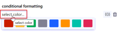
Conditional formatting:
You can display the scalar in different colors based on conditions you defined here. For example, you can display the scalar in green when the value is below 100 and in red when it is above 100.
Click on add to configure a condition.
Click on select color.... to open the color picker. Select the color for this condition.
Enter your condition in the field next to the color. You can use the
valueproperty and manipulate it with JavaScript String and Regex APIs. When you click on the mustache picker, you'll get some examples:Value is greater than something, less than something, etc.
For example:
{{value < 10}}(The color you picked will be used if the value is less than 10)Value is present in the result
For example:
value.IndexOf('error') != -1(The color you picked will be used if the string value "error" is present in the results)Value matches one of the regular expressions you defined
For example:
value.match(/healthy|good|up/)(The color you picked will be used if the string values arehealthy,good, orup)
Display:
Here you decide how the color is used:
Tile background Highlight the tile in the color you defined. Text foreground
Display the text in the color you defined. Link options
Allows you to turn the graph item(s) into links. You can either enter plain text to create a fixed link (URL always stays the same) or use dynamic properties to create a dynamic link.
Dynamic links make use of dynamic properties which are inserted as part of the URL. This creates a template URL that will be resolved to an actual URL based on the items properties.
For example, if you want to link to tickets in your ticket system and the format of the URL for tickets in your system is
https://www.my-system/ticket-123, where123is the ticket ID, you can use the dynamic property that contains the ticket ID and enter the dynamic URLhttps://www.my-system/ticket-{{ticketID}}.For scalars, you can only use the dynamic property
valuein dynamic links, which means the link changes when the value of the scalar changes. Since a scalar is just one item, it would also make sense to use a fixed link, for example the link to the website of which you are displaying the response time.For status icon or bars and the rows of a grid, you usually want to use a dynamic link since you get multiple items or rows that represent different things. You can use any of the dynamic properties the mustache picker offers you.
Examples for URLs with dynamic properties for popular APIsDynamic mustache properties and values you need to change according to your instance are highlighted in bold.
ServiceNow incidents:
https://<your-instance>.service-now.com/nav_to.do?uri=%2Fincident.do%3Fsys_id%3D{{sys_id}}PagerDuty incidents:
{{incident.html_url}}Azure DevOps projects:
https://dev.azure.com/<your-instance>/{{name}}Azure DevOps builds:
https://dev.azure.com/<your-instance>/_build/results?buildId={{id}}Zendesk tickets:
https://<your-instance>.zendesk.com/agent/tickets/{{id}}Azure Application Insights
https://portal.azure.com/#@squaredup.net/resource/{{ResourceId}}Click done to save the tile.
The tile now shows data according to your settings.
How to configure a Performance tile Report
Add a new tile to a dashboard or perspective and choose the Performance tile.
Choose the Report visualization.
 About the Report visualization
Allows you to compare metrics, such as two different metrics or metrics over different time periods. For example, compare
Processor TimewithMemory Available, or comparePercentage CPUwith the same period last week.

For a step by step guide to using this tile jump to Walkthrough: Adding a Report to compare different metrics and/or time periods..
Report editor:
Click on Configure report to switch to the report editor.
In the report editor, you can compare different metrics and time periods with each other:A Layer contains the object and the metric. By adding new layers, you add new metrics and compare them with each other.
Time comparisons compares different time periods of the same metric in the same layer.
Examples:
If you want to compare how one metric looks compared to the same metric six months ago, you only need one layer with a time comparison.
If you want to compare the CPU usage to the memory usage of one computer, you need two layers with different metrics.
Timeframe (at the top of the editor)

The timeframe section allows you to determine the timeframe for the data. You can choose either to use page timeframe, which allows users viewing the page to change the timeframe on the fly, or for you to set a fixed specific timeframe which will ignore the page timeframe settings.
What is the page timeframe?The page timeframe is the timeframe setting a dashboard
or perspective is currently using. When a user changes the page timeframe, all tiles that use the page timeframe will adapt to the new timeframe. Tiles that don't use the dynamic page timeframe aren't affected and won't change.Dashboard Server automatically uses the highest resolution data available for the time period.
If for example you are comparing a weeks worth of data with this time last week, then last weeks data (days 8-14) will most likely being showing hourly data, because by default the retention settings only keep raw data in the Data Warehouse for 10 days (see How to optimise the Data Warehouse - 5 Point Plan). Note: Using the page timeframe can lead to impossible time comparisonsIf your report uses the page timeframe, some page timeframe settings might make it impossible to show a time comparison. The page timeframe must be set to a shorter range than the time comparison.
Example: Your report uses the page timeframe and your time comparison is set to last week (which means 7 days ago from today). When a user changes the page timeframe to last 30 days (which means 30 days ago from today), the time range of the report data is longer than the time comparison.How to identify this issue:
When the comparison line cannot be shown a yellow exclamation mark will be shown at the top right of the tile with a message similar toTimeframe from 5/25/2019 10:26:00 AM to 6/24/2019 10:26:00 AM cannot be shifted by the range 'Last7Days' because it is longer than the range.How to fix this issue:
If you set your report to a specific timeframe, this issue will not occur since the page timeframe will be ignored.Scope
The scope allows you to define which objects are shown, which in turn determines which metrics are available.
Note for using the group or advanced option:
By default the scope of Performance tiles will look at multiple levels of membership (recursive search) for objects, so they will look at multiple-levels of membership rather than just one level. This means the tile shows data for objects that aren't directly contained in a group, but are contained within other objects. For example, this allows you to find disk metrics when scoped to a server.
If the scoped group contains only subgroups and you have not specified a class, then no metrics will be available in the metrics drop down list. By specifying a group AND a class it means that you can extend this recursive search to use top-level groups to show graph data for objects within sub-groups (as well as objects).
To enable recursive searching to work for sub-groups you should specify a group AND a class in the advanced scope option. This will allow the dropdown list to show the metrics for the objects in the sub-groups.
Note for choosing a class:
Choose your class carefully as for a Performance tile this will determine which metrics are available in the Metric panel.
Note for Scalars:
The Scalar visualization should be scoped to only one
object using the list option, as only one figure is shown. Do not use agroup .Scope options on dashboardsTip: If you experience any problems with scoping tiles, you'll find FAQs and help in the article How to scope tiles.
List List allows you to select one or more objects or groups.
You can add multiple
objects and groups . To remove anobject or group click the x to the right of its name.Tip: Start typing and after two characters you'll see suggestions that match the name appear.
Tips for using wildcards when searching for objects or groupsBy default searching will look for the top 10 items containing the words listed in the search. If you wish to create a more specific search you will need to use wildcards (*).
If you place a wildcard after the term you are looking for, it will find all the objects which start with that word searched and any terms that may follow. If you place a wildcard at the start of the search term, it will look for objects that contain the searched word and also have terms before that word.
If you enclose your searched term in wildcards it will look for objects which contain the searched word, this object will not begin or end with the term searched.
Group Group allows you to select members of a specific group. Only one group can be selected.
Advanced Advanced allows you to select a group, class or both. You must at least define either a group or class. You can define both. You can also use criteria to narrow down your selection.
Group:
Same as the group option above.
Class:
Class equates to the target class within SCOM. As you type the dropdown will be populated with suggestions of matching classes from SCOM, from which you can select the required class.
Criteria:
Criteria allows you to create an expression to further refine the scope.
Examples for commonly used criteriaObjects you would like to see Criteria Objects with particular text in their name DisplayName like '%Server1%'Objects starting with a particular string DisplayName like 'test%'All objects in maintenance mode InMaintenanceMode = 'TRUE'Only healthy objects HealthState = 1Objects with a health state in SCOM of 0, an unknown health state (uninitialized), a gray health state icon with a question mark. HealthState = 0Objects that are not healthy HealthState != 1Objects in critical state HealthState = 3Objects in critical or warning state HealthState = 2 or HealthState = 3To show all gray uninitialised objects HealthState = 0 OR HealthState IS NULLAll objects not in maintenance mode InMaintenanceMode != 'TRUE'Objects where the parent agent is offline IsAvailable='false'Objects that are offline, in maintenance or state unknown IsAvailable='false' OR InMaintenanceMode=1 OR HealthState=0Computers with a particular OS OSVersion = '6.3.9600'List objects by name and filter by HealthState (Name like '%Server3%' OR Name like '%Server4%' OR Name like '%Server2%') AND HealthState=3List objects by SCOM Id and filter by HealthState Id IN ('7021174b-9e5d-5fbf-878a-42b9f0bf6f4a', '9bd4a1cc-f07a-0e36-b37d-d9ee974e0f3c') AND HealthState=3Exclude object from the Group specified DisplayName not like '%server3%'Exclude objects from the Group specified (DisplayName NOT LIKE '%server3%') AND (DisplayName NOT LIKE '%server4%')For more information see:
Scope options on perspectivesNote: If you never used a perspective, you should read Working with perspectives before scoping tiles on perspectives.
The power of perspectives is that tiles on a perspective can use a dynamic scope. A dynamic scope considers the currently viewed
object . A dynamic scope consists of two different states:the configuration of the scope in the tile (for example, "consider child objects of type logical disk for the currently viewed object")
the actual resolved scope that depends on which
object you are currently viewing ("this object has 5 child objects of type logical disk")
After configuring the dynamic scope once in the tile, you'll get different results depending how the scope is resolved on the different
objects you are viewing.Suggestions
Suggestions are generated based on the object you are currently viewing. You'll see a list of relevant scope options based on the object's relations to other objects. Suggestions don't cover every possible scope, but they are a quick and easy way to select a suitable scope for your tile.
Note: Suggestions won't be shown if an object has no children, parents or siblings.
Tip: If the exact scope you want isn't listed in the suggestions, you can select a suggested scope that is similar to the one you want, and then click on custom. The custom section will now automatically be filled with the suggestion you picked and you can edit the scope here to adjust it exactly to your needs. This is a more intuitive way to pick a scope than starting in the custom section and navigating the SCOM object model for classes and groups.
Double-check the scope when using suggestions: Using suggestions is an easy way to pick a scope, but you need to make sure that the generated suggestion is appropriate for all objects that use the perspective.
For example, when you pick a suggestion for an EA, you will get suggestions that are specific to the map, dependencies, and availability tests for this one EA. On perspectives you want to use for all EAs, you have to change the scope suggestion in the custom section so that the tile work for all EAs.Walkthrough: Editing a scope suggestion to make it work for all EAsEnterprise Applications are designed so that you can map out the servers that make up the application. You can then configure tiles to show information related to just the servers on the EA's map. When you create a perspective that will be used for all EAs, you need to make sure that you scope the tiles so that they work for any EA. When you start with a suggestion, the tile's scope only works for the one EA you're currently looking at, and this is why you need to edit the scope:
For an EA you want to scope to the servers that are specified on the EA map by selecting something from the suggestions (Dashboard Server 4.2 and above) that shows something similar to the following:
This /<YourApplicationName> Map / ... / Windows ComputerThe above will scope the tile to all the objects of class Windows Computer on this EAs map.
The screenshot below shows some scope suggestions for an application called FinanceXS. The bold text shows the currently selected scope is This object. The cursor shows the option
This / FinanceXS / ... / Windows Computer. Once chosen this scope will show all the Windows computers shown on the applications map.Next, we need to adjust the specified scope to allow it to work for all EAs, rather than just this one.
- In the scope section click custom.
Click on the text
<YourApplicationName> Map (children)which is your first scope step. This will expand the scope step so you can edit it.Remove the auto-populated class
<YourApplicationName> Mapby clicking the cross x next to it.Start typing
Enterprise Application - Mapand select this from the list to add this class. This is so that this tile scope will work for all EAs, rather than just this one EA.- The scope is now configured to show all the Windows computers on the EA's map, whichever EA you happen to be viewing with the perspective.
How to read the suggestionsYou can pick between "this object" and objects that are related to this object as parents, children or siblings. The suggestions for children are written as paths that follow the SCOM object tree structure, parents and siblings can be identified by the word parent or sibling in the suggestion.
A parent of an object is any object that hosts or contains that object.
A child of an object is any object that this object hosts or contains.
A sibling of an object is any object of the same class that is hosted by the same parent.This object The dynamic scope will be resolved to the object currently viewed.
"this object" option which does NOT mean the actual one object like for the target setting but the relative object I'm looking at
This / child/child/class of objectThe dynamic scope will be resolved to children of the object currently viewed.
You select objects of a particular class that are contained in path. The class of the objects you are selecting is stated at the end of the path.
This / * The dynamic scope will be resolved to children of the object currently viewed.
If a path ends with a wildcard (*) it means that you select all objects of any class within the path.
Technically it means that we fill the class field with the class "logical entity" since every object in SCOM has this class, it is a "base" class
Example:
This / IIS Web Server / *selects all objects of any class in the level belowThis / IIS Web Server.This / child/ ... /class of objectThe dynamic scope will be resolved to children of the object currently viewed.
If a path contains an ellipsis (...) it means that you select objects of a particular class that are contained in all of the objects that are contained in the path preceding the ellipsis. The class of the objects you are selecting is stated at the end of the path.
Example:
This / Sales App Map / ... / Windows Computerselects all objects of the class Windows Computer in theThis / Sales App Mappath.Parent class of objectThe dynamic scope will be resolved to parents of the object currently viewed. Sibling class of objectThe dynamic scope will be resolved to siblings of the object currently viewed. Show more triangle next to a suggestion
You can click the show more triangle to expand the list of suggestions and see more specific paths.Example for navigating suggestions in an EAIf you are looking at an EA, the path to find all windows computers in that EA may read
Map / ... / Windows Computer. It returns all objects of the Windows Computer class contained within all of the paths underMap.To narrow the scope down, you can click on the triangle to expand the suggestion and select one of the more specific paths. If you select
Map / Web / Windows Computeryou will find all objects of the Windows Computer class in the pathMap / Web.If you choose the option
Map / *you'll find all objects contained in the map. If you extend this suggestion by clicking on the triangle, you'll see suggestions to select all objects in a more specific path, for exampleMap / Web / *.Custom
Here you can pick objects that are related to the object you are currently looking at. If you want to create a specific scope that is not listed under suggestions, you can create the scope here.
Tip: You can pick a similar scope under suggestions first and then click on custom to edit it.
How to pick a simple relation (one step through the SCOM model)At the top, you'll see the name of the object you are currently looking at. Now you can choose if you want to pick parents or children of that object, and if this parent or child relation should be considered only one level up or down the SCOM model or through all levels.
Class:
Here you pick the class of the objects you want to select. If you leave this field empty, the scope falls back to the "this object" scope.
Note: You will only see groups and classes that the object you are currently looking at is a member of.
Tip: If you want to pick objects of any class, enter the SCOM base class logical entity in the class field.
Tip: If you want to find out what classes the object you are interested in belongs to, you can go to the Monitored Entity perspective of that object. You'll see all the classes the object belongs to listed there.
Criteria:
You can narrow the selection of objects of a particular class down further by entering criteria for those objects. For more help see How to use criteria when scoping objects.
Tip: If you want to find out what properties you can base your criteria on, you can go to the Monitored Entity perspective of the object you are interested in. You'll see all the properties for criteria listed there.
.
Example for picking a simple relationFor example, for a perspective created for the group IIS8 Computer Group adding a Status tile scoped to show children with a class of
objectwill show the group members, i.e. the members of the IIS8 Computer Group.How to pick advanced relations (multiple steps through the SCOM model)If you need to traverse a more advanced SCOM object model like an EA, you can use the + button to add more steps. This creates a scope that can go through any kind of path of the SCOM object model.
Complete the following steps and then click the + button after you're done to add the next level of SCOM objects:
At the top, you'll see the name of the object you are currently looking at. Now you can choose if you want to pick parents or children of that object, and if this parent or child relation should be considered only one level up or down the SCOM model or through all levels.
Class:
Here you pick the class of the objects you want to select. If you leave this field empty, the scope falls back to the "this object" scope.
Note: You will only see groups and classes that the object you are currently looking at is a member of.
Tip: If you want to pick objects of any class, enter the SCOM base class logical entity in the class field.
Tip: If you want to find out what classes the object you are interested in belongs to, you can go to the Monitored Entity perspective of that object. You'll see all the classes the object belongs to listed there.
Criteria:
You can narrow the selection of objects of a particular class down further by entering criteria for those objects. For more help see How to use criteria when scoping objects.
Tip: If you want to find out what properties you can base your criteria on, you can go to the Monitored Entity perspective of the object you are interested in. You'll see all the properties for criteria listed there.
.
Other specific objects
Gives you the normal, non-dynamic scope options you are used to when scoping tiles on dashboards. This means the tile will not dynamically adapt it's content to the currently viewed
object , it will always show data for the staticobject picked here.Since the power of perspectives is that their tiles can show data for different
objects depending on whatobject is currently being viewed, you should only select this option when you are sure that there is no relationship between the desired scope and the currently viewedobject .Metric
Here you define which value the graph will show. For example, if you want to see the response time of different servers, your metric value would be response time. If you want to see the number of tickets, your metric value would be number (of tickets).
Choosing the metricQuick find:
The drop-down list will show you a list of all metrics available for the scope you have set. Press the down arrow on your keyboard in the choose metric field to see the list.
Advanced:
Allows you to specify the object, counter and/or instance. For example, you can use the quick find to find and select the metric
LogicalDisk - % Free Space, and then click on advanced and specifyC:in the instance box to only view C: drives.You can also use metric > advanced to show multiple metrics on one graph (How to show multiple metrics on one graph (v4.2 and below)) or use wildcards in metrics (How to use wildcards in metrics).
Choosing the ResolutionDashboard Server uses the highest resolution data available (raw, hourly or daily), based on what data is available in the Data Warehouse for the whole graph time period.
The auto resolution setting (v4.3 and above) automatically changes the resolution to a more suitable resolution when the page timeframe is changed by a user, in order to optimise the time to return the graphs.
The data available in the Data Warehouse is determined by the retention period (see How to optimise the Data Warehouse - 5 Point Plan) set in SCOM. When the retention period for hourly data is set to 180 days and a Dashboard Server graph is set to display 6 months of data, this can actually be 182 or 183 days. Dashboard Server will switch to daily data because hourly data is not available for the full 6 month period, i.e. the retention period is less than the date range. The solution is to modify the retention period to reflect 6 months i.e an extra 5 days and set the retention period to 185 days, this should not affect your storage levels too greatly. After a few days this will resolve the problem because 6 months of hourly data will then be available, when Dashboard Server checks the retention period against the requested time frame, the retention period would be higher and Dashboard Server would show hourly data.
Choosing the aggregate value typeWhen a resolution of hourly or daily is chosen you can select whether you'd like to see the average, minimum or maximum figures for that aggregated time period. For example, for a web transaction you might want to see the maximum or minimum figures rather than the average.
Choosing the metric labelThis allows you to specify that metric label, which is then displayed on the y-axis and hover value.
You should select the label that matches how the the data is being returned, or use the other option to specify a custom metric label, such as pages/sec or count.
Top N
Here you can define a limit for the number of results you want to see. Activate the limit number of results displayed checkbox to enter a limit for results. You can choose if this limit should be applied from the top ranking results down (ascending, default option) or from the bottom ranking results up (descending).
Creates a new line in the graph that shows the same data, but how it looked like in the past. The line will be a dashed line to be easily identifiable as a time comparison. If the line refers to the same object, the lines will be the same color, with the time comparison line in a lighter shade.
You can choose different points in the past between yesterday and 12 months ago. If you don't want a time comparison line in your graph, leave the setting to none (default).
 Why can a time comparison line refer to a different object?
For Dashboard Server v4.4 and above:
The time comparison always shows the same objects. The top n setting is applied to the objects for the current time period, and then the same objects are shown for the time comparison as dashed lines.For Dashboard Server v4.3 and below:
When you limit the number of results using the top n option in a time comparison in the Report tile, the top n lines are shown for the current time period can be different from the top n lines shown for the time comparison period. For example, if your top n settings limit the number of results to the top 5 results (ascending) and compare them to the results 30 days ago, there might be different results in the top 5 which leads to different objects shown in the graph.Note: Only the lines shown for the current time period are shown in the legend, which may not be clear when using Open Access.
Why is the time comparison line less detailed than the original line?Dashboard Server automatically uses the highest resolution data available for the time period.
If for example you are comparing a weeks worth of data with this time last week, then last weeks data (days 8-14) will most likely being showing hourly data, because by default the retention settings only keep raw data in the Data Warehouse for 10 days (see How to optimise the Data Warehouse - 5 Point Plan). Y-axis
Here you can decide if the values (y-axis) and labels for this layer will be shown on the left or right side of the graph.
If you want to compare two different metrics, it makes sense to put one layer's metrics on the left side and the other layer's metrics on the right side.
Label
auto Choose this option if you want to use the default label that has been created automatically.
custom
Here you can change the label to a custom label. You can use static text and dynamic properties. Use the mustache picker
to select dynamic properties from the response data to use them as labels.For more information see How to use Custom Labels
Important note if you are using external API properties with hyphens for custom labels (Web API tile, Elasticsearch tile, Splunk tile)Property names that contain hyphens (for example
properties.name-with-hyphens) can't be processed due to a JavaScript limitation. If you want to use a property that contains a hyphen, you have two options:If you have access to the data source and can change the name of the property, change the name of the property to a name without hyphens.
For example, if your Elasticsearch query uses a property (an aggregation, a grouping or any other property you want to use) with a name that contains a hyphen, you can either access your Elasticsearch instance and change the name there or you can overwrite the name in the query dsl field.
If you can't change the name of the property, you need to enter the property name in the following format:
Original property name:
{{properties.name-with-hyphens.value}}New format:
{{properties['name-with-hyphens'].value}}
Click back to dashboard in the upper left corner to get back from the report editor to your dashboard.
If you want to define further settings for your report, you need to switch the dashboard to edit mode and edit the tile.
Timeframe:
There is only one timeframe for the report and it can be controlled from two different places, here and in the report editor. If you change the timeframe here, the timeframe in the report editor changes. If you change the timeframe in the report editor, the timeframe changes in this panel.
The timeframe section allows you to determine the timeframe for the data. You can choose either to use page timeframe, which allows users viewing the page to change the timeframe on the fly, or for you to set a fixed specific timeframe which will ignore the page timeframe settings.
What is the page timeframe?The page timeframe is the timeframe setting a dashboard
or perspective is currently using. When a user changes the page timeframe, all tiles that use the page timeframe will adapt to the new timeframe. Tiles that don't use the dynamic page timeframe aren't affected and won't change.Note: Using the page timeframe can lead to impossible time comparisonsIf your report uses the page timeframe, some page timeframe settings might make it impossible to show a time comparison. The page timeframe must be set to a shorter range than the time comparison.
Example: Your report uses the page timeframe and your time comparison is set to last week (which means 7 days ago from today). When a user changes the page timeframe to last 30 days (which means 30 days ago from today), the time range of the report data is longer than the time comparison.How to identify this issue:
When the comparison line cannot be shown a yellow exclamation mark will be shown at the top right of the tile with a message similar toTimeframe from 5/25/2019 10:26:00 AM to 6/24/2019 10:26:00 AM cannot be shifted by the range 'Last7Days' because it is longer than the range.How to fix this issue:
If you set your report to a specific timeframe, this issue will not occur since the page timeframe will be ignored.Data range:
The Data Range option allows you to choose the range of data the graph will display. For line graphs, this means the data on the y-axis.
percentage Shows 0 to 100 fit to data Shows the data minimum to data maximum fit to data (from zero) Shows from 0 to the data maximum custom Allows you to specify the min and max custom fit Allows you to specify the min and max limits, so that data outside your settings will not be shown. If all the data falls within your specified ranges then the y-axis range will fit to the data rather than your caps.
Height:
Height: Allows you to set the height of the tile with a slider.
Legend:
Allows you to show or hide the legend of the graph.
Click done to save the tile.
The tile now shows data according to your settings.
How to enable graph color matching
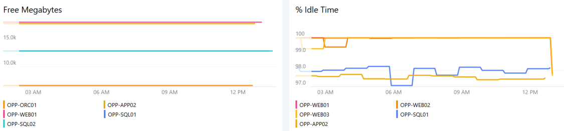
Graph color matching means that one item (a specific resource, object, site, anything you are displaying in your graphs) is shown in the same color in different graphs on one dashboard
Line Graphs, Bar Graphs and Reports (available in Performance tiles) support graph color matching.
Color matching only works when the item uses the exact same label in all graphs.
For Dashboard Server v4.8 and above:
Graph lines on a dashboard will show the same color when the object labels match, even if those graphs show different metrics.
For Dashboard Server v4.7 and below:
Graph lines will only show the same color for the same object when displaying the same metric.
How to use graph color matching
Graph color matching must be enabled for the dashboard
or the perspective . The default setting for all dashboardsand perspectives is color matching enabled.How to check or change the color matching settingThe default setting for graph color matching is on. Here's how you can check or change this setting:
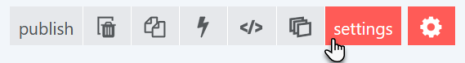
On a dashboard or perspective click the edit button
Click the settings button.
The match by label button is under Graph colors.
If you want to disable color matching, toggle the match by label button to OFF.
If you want to enable color matching, toggle the match by label button to ON.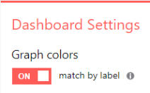
The label for the item must be the same in all graphs that you want to display the same color.
How to ensure labels match across different graphsIn the label panel of your graph, set the label to custom label.
If you are using a mustache property, make sure that you use the same property in all graphs you want to color match.
If you are using a manipulated mustache label (for example, custom text between labels like
Name: {{properties.name}}), make sure to use the exact same label in all graphs you want to color match.If you are using custom text, make sure to use the exact same custom text including upper and lower cases.
For resources that show the same label the colors will now match:
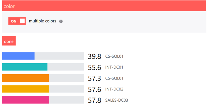
For Bar Graphs (called Bar Top N in Performance tiles), you need to switch on multiple colors to enable color matching. Multiple colors is switched off by default, you need to switch it on for each Bar Graph.
How to switch on multiple colors for Bar Graphs (called Bar Top N in Performance tiles)Go to the color panel of your Bar Graph.
Toggle multiple colors to on.
Bar Graphs will now color match, as long as the dashboard setting match by label is on and the labels do match.
Walkthroughs
Walkthrough: Adding a Line Graph to show % Processor Time.
The Performance tile can be used on a dashboard or a perspective. This walkthrough shows you how to add a Line Graph to a dashboard.
In Dashboard Server navigate to where you'd like the dashboard to be created. Hover over the + button and click dashboard.
Give the dashboard a title, by replacing the text that says New Dashboard.
The dashboard is saved as you go along so there's no need to save your changes. You can find your dashboard by clicking on the right-hand menu ☰ > system > unpublished.
A new tile has already been added to the dashboard. Edit the title by overwriting the placeholder value New tile with your own title.
The tile selector will already be open. Click Performance. The Performance tile button (along with several other tiles) displays a little plus up the top right. This indicates that there are more tiles available from this one button.

Click on the Line Graph button to create a line graph.

Next we need to scope the tile. In the scope section select group then type the name of a group, such as the
IIS Computer Groupand then click on the group from the results.Correctly scoping the tile is very important. To find out more about advanced scoping options see How to use criteria when scoping objects. On perspectives the tile scope will only show you the groups and classes that the object you have drilled down to is a member of.
Click next.
The quick find option will find metrics available for the scope you have set. Either start typing, or press the down arrow on the keyboard to see a list of all the metrics available. For this walkthrough type
processorand then select the metricProcessor Information - % Processor Time.Performance graphs for the servers should appear after a moment. You could stop here, but we'll continue to configure the tile.
Under metric label click on percent. % symbols will show on the y-axis of the graph, and very small values will be shown in percent rather than milli values (see Understanding the figures on Performance graphs).

Click next.
Leave the Timeframe set to use page timeframe so the time period for this tile changes when users change the page timeframe.
Click next.
In the top n section limit the number of results displayed to 3, and tick descending to show those with the highest processor utilization.
Leave data range as it is.
In the display section drag the slider to increase the graph height.

Leave the label section as it is. For more information on changing the label see How to use Custom Labels.
Click done.

Walkthrough: Adding a Heatmap to show % Processor time and Logical Processors.
- Click the orange + plus button to add a new tile to the dashboard.
Click Performance, and then the Heatmap button.

In the scope section select group then type the name of a group, such as the
IIS Computer Groupand then click on that group in the results. On perspectives the tile scope will only show you the groups and classes that the object you have drilled down to is a member of.In the metricquick find section type
processorand then select the metricProcessor Information - % Processor Time.A heatmap should appear after a moment.
- Once you've chosen a metric give the tile a title which explains what the tile shows.
In the display section adjust the width and height sliders to change the heatmap sizes.
In addition, you can choose to use a property to determine the size of each rectangle, for example logicalProcessors.

By default objects with no data are hidden, you can choose to show them by ticking the box show objects with no data.
- The color section allows you to change the heatmap color.
- Leave the data range section as it is for now. This allows you to change the range of values shown.
- Leave the label section as it is. For more information on changing the label see How to use Custom Labels.
Click done.

Walkthrough: Adding a Report to compare different metrics and/or time periods.
This walkthrough shows you how to add metrics as layers to the Report tile, and also how to compare them with historical data.
Click on the Report button to create a Report.

Give the tile a title.
The Report tile uses layers to allow you to add multiple metrics to one graph for comparison. This could get difficult to view in a narrow column, so this tile allows you to edit the tile full screen in a report editor). Click configure report to open the report editor and add layers.


The report editor has opened full screen, but you can return to your dashboard at any time by clicking the back to dashboard button at the top right. The layer configuration appears on the left side of the screen, and a preview of the graph will show on the right as your proceed.
The first layer is expanded ready for you to edit. Give the layer a title, such as the metric you intend to add.
For this walkthrough we are going to compare two metrics for one machine. In the scope section click list then type the name of a machine, and then click on that machine in the results.
In the metric > quick find box type the name of the first metric you want to add.
For this walkthrough type
processorand then select the metricProcessor Information / % Processor Time.The right side of the screen will show a preview of the graph. You could stop here, but we'll continue to configure the tile.
Click done.
Click the orange plus button to add a second layer for your next metric.
Give this layer the title of the metric you are adding.
Click list then type the name of machine you used for the first layer, and then click on that machine in the results.
In the metric > quick find box type the name of the first metric you want to add.
For this walkthrough type
memoryand then select the metricMemory / PercentMemoryUsed.Leave the top n section as it is for this walkthrough.
You might like to add a line to allow you to compare this data with historical data. Adding the time comparison is optional.
In the time comparison section click one of the time periods to compare with this data, for example click yesterday.

To add a time comparison for the existing layer, hover over the existing layer and then click the compare layer button to jump straight into the time comparison section and then click yesterday.

In the y-axis section click on right to get the PercentMemoryUsed graph to use the right-hand y-axis.
This is useful because the two metrics use quite different scales, so the two graphs show more clearly using two different y axes.
Leave the label section as it is. For more information on changing the label see How to use Custom Labels.
At this point the graph is complete, so you can click done and then the back to dashboard button up the top right of the page.

Return to editing the Report tile by clicking the edit this dashboard button at the top right, and then the edit tile button to the top right of the tile itself.
Click into the legend configuration section and click on show legend to tick the box.
Click done.

Using the Performance tile
The Performance drilldown
Clicking on a line graph, bar chart or sparkline will take you to a Performance drilldown page, shown below:

From here you can:
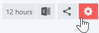
- Change the timeframe using the buttons along the top or by clicking on the graph itself.
- Compare the data to another object or group of objects.
- Export the performance data to Excel for further analysis (see Export to Excel).
- See the minimum, maximum and average for the time period. See Understanding the figures on Performance graphs.
FAQs
How do I get the line colors to match for the same objects on different graphs?
Ensure that the labels match, jump to How to use the Performance tile.
How do I show a metric that has a comma in the name?
See How to use wildcards in metrics.
How can I show more than one metric on the same graph?
For Dashboard Server v4.3 and above use the Report tile (jump to How to configure a Performance tile Report), for v4.2 and below see How to show multiple metrics on one graph (v4.2 and below).
What does the m µ k or M mean on the performance drilldown page? Why isn't GB shown?
See Understanding the figures on Performance graphs.
Why is the time comparison line not shown?
If your report uses the page timeframe, some page timeframe settings might make it impossible to show a time comparison. The page timeframe must be set to a shorter range than the time comparison.
Example: Your report uses the page timeframe and your time comparison is set to last week (which means 7 days ago from today). When a user changes the page timeframe to last 30 days (which means 30 days ago from today), the time range of the report data is longer than the time comparison.
How to identify this issue:
When the comparison line cannot be shown a yellow exclamation mark will be shown at the top right of the tile with a message similar to Timeframe from 5/25/2019 10:26:00 AM to 6/24/2019 10:26:00 AM cannot be shifted by the range 'Last7Days' because it is longer than the range.
How to fix this issue:
If you set your report to a specific timeframe, this issue will not occur since the page timeframe will be ignored.
Why is the time comparison line less detailed than the original line?
Dashboard Server automatically uses the highest resolution data available for the time period.
Why are the time comparison lines showing different objects to those shown on the legend?
For Dashboard Server v4.4 and above:
The time comparison always shows the same objects. The top n setting is applied to the objects for the current time period, and then the same objects are shown for the time comparison as dashed lines.
For Dashboard Server v4.3 and below:
When you limit the number of results using the top n option in a time comparison in the Report tile, the top n lines are shown for the current time period can be different from the top n lines shown for the time comparison period. For example, if your top n settings limit the number of results to the top 5 results (ascending) and compare them to the results 30 days ago, there might be different results in the top 5 which leads to different objects shown in the graph.
Note: Only the lines shown for the current time period are shown in the legend, which may not be clear when using Open Access.
Troubleshooting the Performance tile
The Performance tile accesses the Data Warehouse directly using the published schema, so must have a Data Warehouse connection with the correct permissions for Performance graphs to work.
No Performance graphs anywhere in Dashboard Server
If no graphs are showing anywhere in Dashboard Server, Dashboard Serveris particularly slow, or you are seeing connection or login failed errors on all Performance tiles, you should check the Data Warehouse connection, see Troubleshooting the Data Warehouse connection.
Only some graphs are shown in Dashboard Server
If you are seeing some graphs in Dashboard Server, this means the Data Warehouse connection is configured correctly. If some Performance tiles show blank or show an error you should troubleshoot these tiles individually.
Errors
Symptoms
A Performance tile or Matrix tile shows no graph (graph tile is blank) or an error similar to the following:
The server encountered a problem whilst processing the request.
No values found for the given metric for the last <time period> at the resolution 'raw/hourly/daily'.

Cause
This error indicates that there is no data to show. There are several reasons why there may not be any data:
- No data is being collected.
- The SCOM collection rule is saving data to the Operations Manager database, but not to the Data Warehouse database.
- For the chosen timeframe there is no data.
- For the chosen scope and metric there is no data.
- The group specified contains only subgroups and you have not specified, or have removed, the class.
Procedure
Install the latest version of Dashboard Server.
Check the Data Warehouse connection.
If this message is shown for all performance graphs in Dashboard Server then you should check that Data Warehouse specified is correct.
Check data is being collected.
Dashboard Server uses data from the Data Warehouse database. If the data is available in SCOM this means the data is being collected and stored in the Operations Manager database. SCOM Reporting uses the Data Warehouse database, so if the data appears in a report then it is in the Data Warehouse.
How to trigger the workflows to collect dataFlush the health service state and cache to trigger the workflows to collect the data, either using SCOM or Dashboard Server.
To do this in Dashboard Server, browse to the object in Dashboard Server, then:
- Click on the Monitored Entity perspective.
- Click on Health Service in the Children section.
- Click the task button at the top of the page.
- Select the task Flush Health Service State and Cache.
- Click execute.
Change the timeframe.
Change the page or tile timeframe, to see if there is data over a different period of time.
There may be no data points available if you are using hourly data and looking at the last 1 hour (metric > timeframe is set to hourly and the tile or page timeframe is set to last 1 hour), or using daily data and looking at the last 24 hours (metric > timeframe is set to daily and the tile or page timeframe is set to last 24 hours).
When the timeframe section has use page timeframe selected the tile will use the page timeframe.
What is the page timeframe?The page timeframe is the timeframe setting a dashboard
or perspective is currently using. When a user changes the page timeframe, all tiles that use the page timeframe will adapt to the new timeframe. Tiles that don't use the dynamic page timeframe aren't affected and won't change.When the timeframe section has specific timeframe selected the tile will use the timeframe specified in the tile timeframe section. Only SCOM administrators or Team Folder authors/owners can edit the tile tileframe.
Tile timeframe:
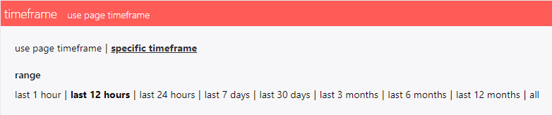
Dashboard Server uses raw data by default as long as it is available for the whole reporting timeframe, then it will use hourly, and when that is not available for the timeframe it will use daily data. Whether raw or hourly data is available for the whole timeframe will depend on your Data Warehouse data retention settings. Using the default SCOM data retention settings means that Dashboard Server timeframes of 1 week or less will probably be using raw data, for timeframes between 30 days and 12 months Dashboard Server will be probably be using hourly data. The SCOM data retention settings may well have been changed from the default. For more information see How to optimise the Data Warehouse - 5 Point Plan - 4. Data Retention.
Check the metric.
The quickest way to check the metric is correct, is to clear the existing metric and use the down arrow button on the keyboard to view all the metrics available for the scope you have chosen.
You may get the
No values found for the given metricmessage returned if you change the scope after setting the metric.
Symptoms
A Performance tile shows the following error instead of data:
timeout-command: Timeout expired. The timeout period elapsed prior to completion of the operation or the server is not responding.
Cause
The Performance tile accesses data from the Data Warehouse directly using the published schema.
The SQL timeout is 30 seconds by default and it is not configurable.
It is not configurable for two reasons:
a) If the query is taking longer than 30 seconds then it's already putting a significant load on your Data Warehouse
b) 30 seconds is already a long time for a user to wait.
Procedure
Install the latest version of Dashboard Server.
Check the Data Warehouse.
One option to address these timeouts is to check the performance and load on the SCOM Data Warehouse server, and if necessary provide your Data Warehouse with more compute resources.
Reconfigure the dashboard.
- Reduce the scope of the dashboard to fewer servers, by clicking on Scope and selecting a group with fewer members. i.e. create a small group in SCOM for testing.
Performance bar charts are expensive. In the metric section check the resolution.
If raw is selected this may account for the Data Warehouse timeout, change this to hourly as this is the recommended and faster setting.
If hourly is selected, then change it to daily, or perhaps raw just to see if this then displays data.
- Try changing the visualization to a Performance line graph or sparkline to see if data is returned.
- Remove one or more of the Performance graphs from the dashboard.