How to use the Performance tile
The Performance tile shows graph visualizations of Azure Monitor metrics data.
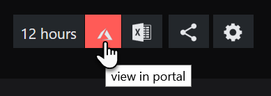
Graphs can be clicked on to drilldown to the resource dashboard, and from there the view in portal button allows you to link to the resource in the Azure portal.
How to configure a Performance tile
The following steps guide you through configuring all visualizations except the Report, since configuring a Performance Report works a little bit differently. If you want to configure a Report jump to How to configure a Performance tile Report.
Add a new tile to a dashboard or perspective and choose the Performance tile.
Select the visualization for your Performance tile and click next.

 Bar Top N
Uses the latest data to compare data, such as the top or bottom ranking metrics in descending or ascending order, as 'Top N'.
Visualizes both a number and the resulting bar width based on the number value.
Example:

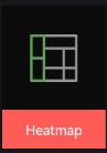
 Heatmap
Displays a metric value as a color shade.
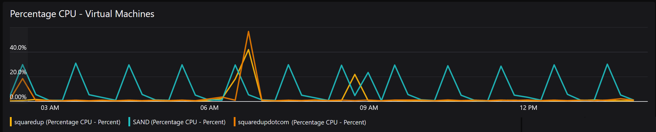
Jump to Walkthrough: Adding a Line Graph to show % Processor Time..
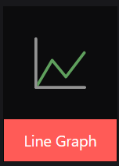
 Line Graph
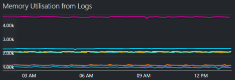
Shows data over time, in a graph with an x-axis (time) and a y-axis. You can show several objects, such as servers, in one graph.
Example:
Jump to Walkthrough: Adding a Line Graph to show % Processor Time..
 Sparklines
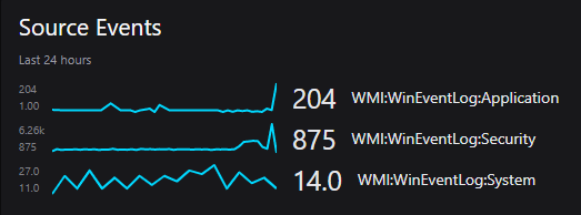
Shows data over time (like line graphs), but each item gets its own graph instead of showing all lines in one graph.
Example:
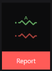
 Scalar
A single value such as a number of customers or incidents.
Example:

Scope:
The scope section allows you to define what is shown.
Scope options on dashboardsTip: If you experience any problems with scoping tiles, you'll find FAQs and help in the article How to scope tiles.
Note: By default, results are shown across all subscriptions (unless the subscription option is chosen to specify only one or more subscriptions).
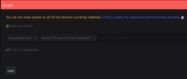
Filter by tenant By default results are shown across all tenants. In Dashboard Server 4.7 and above a user who has access to multiple tenants will see a filter by tenant option.
If you see the message "You do not have access to all of the tenants currently selected" or "Tenant ID could not be resolved"In a multi-tenant environment a user who does not have access to all tenants will see this message if they attempt to edit a scope containing tenants that they do not have access to. This may be because:
- One Dashboard Server admin has added a tile scoped to tenants that other Dashboard Server admins do not have permissions to.
- The customer/tenant is no longer serviced by this Customer Service Provider (CSP), so the tenant has been permanently removed for all Dashboard Server admins.
Symptoms
A tile scope shows:
"You do not have access to all of the tenants currently selected. Click here to reset which will remove those tenants from the scope."
Tenants the user does not have access to show as:
"Tenant ID could not be resolved"
Procedure
The message warns users that they do not have permissions to all the tenants in the scope.
If the user chooses to reset and therefore edit the scope then the tenants that they do not have access to will be removed. If saved this scope will also have those tenants removed for users who do have access to them.
It is not possible for the user to edit the scope without those tenants being removed from the scope.
Where a tenant has been removed permanently you may wish to reset the scope to remove the unresolvable tenants.
List List allows you to select several individual items to show.
You can add multiple
items . To remove anitem click the x to the right of its name.Tip: Start typing and after two characters you'll see suggestions that match the name appear.
Note: It depends on the tile what happens when you select more than one item. For example, when you select two virtual machines for a Status tile, you'll see the status of those VMs individually. When you select two virtual machines for a Cost Management tile, you'll see the cost for the two VMs added together.
Resource group Select one or more resource groups.
Filter by type:
Tick filter by type to only show resources of a particular type within the chosen resource group.
Subscription Select one or more subscriptions from the dropdown box if you wish to restrict results to only one or more subscriptions. When this is not used results are shown across all subscriptions.
Filter by type:
Tick filter by type to only show resources of a particular type within the chosen subscription.
Tags Select items with a particular tag. Add the tag name and the tag value you want to use to search for. If you select multiple tags, the search automatically 'ANDs' the tags which means the scope only contains items which are tagged with all the tags listed.
Filter by type:
Tick filter by type to only show resources of a particular type within the chosen tag(s).
Type Scope type can be used to show all resources of a particular type, for example all databases across all subscriptions, by typing
databasesand selectingSQL databases.Show hidden types This works in the same way as the Show hidden types option in the Azure portal.
Hidden types include some ancillary resources which are created/managed by Azure infrastructure. It might be useful to display these resources when cleaning up your resource groups or subscriptions.
Scope options on perspectivesNote: If you never used a perspective, you should read Working with perspectives before scoping tiles on perspectives.
The power of perspectives is that tiles on a perspective can use a dynamic scope. A dynamic scope considers the currently viewed
resource . A dynamic scope consists of two different states:the configuration of the scope in the tile (for example, "consider child objects of type logical disk for the currently viewed object")
the actual resolved scope that depends on which
resource you are currently viewing ("this object has 5 child objects of type logical disk")
After configuring the dynamic scope once in the tile, you'll get different results depending how the scope is resolved on the different
resources you are viewing.On perspectives, you can scope tiles to:
this resource
(only on perspectives for resources)The tile's scope will be the resolved to the resource that is currently viewed. child resources
(only on perspectives for resource groups and subscriptions)When you select this option, the scope of the tile will be resolved to all resources that are in the group or subscription that is currently viewed.
If you want to narrow the scope down to a specific type of resource in the group or subscription, you can filter for one specific type of resource.
other resources Gives you the normal, non-dynamic scope options you are used to when scoping tiles on dashboards. This means the tile will not dynamically adapt it's content to the currently viewed
resource , it will always show data for the staticresource picked here.Since the power of perspectives is that their tiles can show data for different
resources depending on whatresource is currently being viewed, you should only select this option when you are sure that there is no relationship between the desired scope and the currently viewedresource .Here you define which value the graph will show. For example, if you want to see the response time of different servers, your metric value would be response time. If you want to see the number of tickets, your metric value would be number (of tickets).
The drop-down list will show you a list of all metrics available for the scope you have set. Press the down arrow on your keyboard in the choose metric field to see the list.
If no metrics are listed and the tile is showing the message
Resources must all be of the same typego to the Scope panel and check that the resources are all of the same type, such asvirtual machines. For example, if you have selected a resource group in the scope you should tick filter by type to ensure that only resources of one type are returned.For more information about metrics available see Azure Monitor Metrics Overview and Supported metrics with Azure Monitor. Dashboard Server does not support metric namespaces. For more information see Azure Monitor Metrics Data Structure.
After you've chosen a metric, you'll see more options:
Interval
Allows you to select the interval at which you would like to see data points. For example, data points a minute apart, 30 minutes apart, or a day apart.Aggregation
Allows you to control how the data is aggregated when using intervals over 1 minute. For example, if using an interval of an hour would you like to the 60 data points collected in each hour to be aggregated together to show you one point for that hour that is the average figure, or the maximum figure.Custom label:
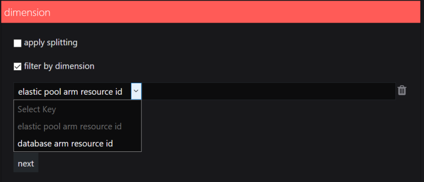
Allows you to specify the metric label.Dimension:
In Azure some metrics may have multiple dimensions. Dimensions of a metric are name-value pairs that carry additional data to describe the metric value. For more information see Azure Monitor Metrics Data Structure.
In Dashboard Server version 4.5 and above you can choose to split and/or filter results using these dimensions. For more information see this Microsoft article Filtering and splitting.
Apply splitting:
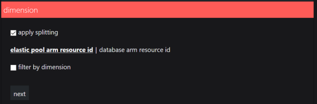
Splitting by a dimension allows you to see a different line for the data for each different value that the chosen dimension has.
When you tick apply splitting you will see a list of all of the dimensions that the scope contains.
Select which dimensions you want to split by, and the data will separate by the different values that the dimension has.
Filter by dimension:
Filtering to a dimension's specific value allows you to see a line that only contains the data for the dimension value that is important to you.
For a metric that has dimensions go into the dimension panel and tick filter by dimension.
Click the add button and a drop down list will allow you to choose your dimension and type in the value of the dimension on the box. This will show you a line that only contains data for the chosen value.
Configure the settings for your visualization:
Settings for Bar Top NWhich timeframe does this visualization use?
This visualization always use the latest data and ignores the dynamic page timeframe set by users.
What is the page timeframe?The page timeframe is the timeframe setting a dashboard
or perspective is currently using. When a user changes the page timeframe, all tiles that use the page timeframe will adapt to the new timeframe. Tiles that don't use the dynamic page timeframe aren't affected and won't change.
Settings:
Data Range
The Data Range option allows you to choose the range of data the graph will display. For line graphs, this means the data on the y-axis.
percentage Shows 0 to 100 fit to data Shows the data minimum to data maximum fit to data (from zero) Shows from 0 to the data maximum custom Allows you to specify the min and max custom fit Allows you to specify the min and max limits, so that data outside your settings will not be shown. If all the data falls within your specified ranges then the y-axis range will fit to the data rather than your caps.
Sort
Sort allows you to change the order of the results displayed. You can sort by value (ascending or descending) or label (alphabetically ascending or descending).
Limit number of results:
This option is only available when you sort by values, not by labels.
Here you can define a limit for the number of results you want to see. Activate the limit number of results displayed checkbox to enter a limit for results. You can choose if this limit should be applied from the top ranking results down (ascending, default option) or from the bottom ranking results up (descending).
Label
Allows you to change the label of the results.
auto Choose this option if you want to use the default label that has been created automatically.
custom
Here you can change the label to a custom label. You can use static text and dynamic properties. Use the mustache picker
 to select dynamic properties from the response data to use them as labels.
For more information see How to use Custom Labels
Important note if you are using external API properties with hyphens for custom labels (Web API tile, Elasticsearch tile, Splunk tile)Property names that contain hyphens (for example
properties.name-with-hyphens) can't be processed due to a JavaScript limitation. If you want to use a property that contains a hyphen, you have two options:If you have access to the data source and can change the name of the property, change the name of the property to a name without hyphens.
For example, if your Elasticsearch query uses a property (an aggregation, a grouping or any other property you want to use) with a name that contains a hyphen, you can either access your Elasticsearch instance and change the name there or you can overwrite the name in the query dsl field.
If you can't change the name of the property, you need to enter the property name in the following format:
Original property name:
{{properties.name-with-hyphens.value}}New format:
{{properties['name-with-hyphens'].value}}
Color
Here you can enable or disable graph color matching.
Settings for HeatmapsWhich timeframe does this visualization use?
This visualization always use the latest data and ignores the dynamic page timeframe set by users.
What is the page timeframe?The page timeframe is the timeframe setting a dashboard
or perspective is currently using. When a user changes the page timeframe, all tiles that use the page timeframe will adapt to the new timeframe. Tiles that don't use the dynamic page timeframe aren't affected and won't change.Settings:
Display
Here you can change the width and height of the individual blocks of the graph. Use the sliders for width and height to change the settings.
Fixed width:
All blocks have the same width and height according to your settings.Property based width:
The blocks' size depends on the property you chose. The more of property x an object has (for example, the number of processors), the bigger the block will be displayed proportionally to the other blocks. You can still define the overall width and height with the sliders.Color
Here you can choose the color scheme for your heatmap. The metrics of your heatmap will be shown in different shades of the color you chose.
Data Range
The Data Range option allows you to choose the range of data the graph will display. For line graphs, this means the data on the y-axis.
percentage Shows 0 to 100 fit to data Shows the data minimum to data maximum fit to data (from zero) Shows from 0 to the data maximum custom Allows you to specify the min and max custom fit Allows you to specify the min and max limits, so that data outside your settings will not be shown. If all the data falls within your specified ranges then the y-axis range will fit to the data rather than your caps.
Label
auto Choose this option if you want to use the default label that has been created automatically.
value Your chosen metric is used as a label none No label custom
Here you can change the label to a custom label. You can use static text and dynamic properties. Use the mustache picker
to select dynamic properties from the response data to use them as labels.For more information see How to use Custom Labels
Important note if you are using external API properties with hyphens for custom labels (Web API tile, Elasticsearch tile, Splunk tile)Property names that contain hyphens (for example
properties.name-with-hyphens) can't be processed due to a JavaScript limitation. If you want to use a property that contains a hyphen, you have two options:If you have access to the data source and can change the name of the property, change the name of the property to a name without hyphens.
For example, if your Elasticsearch query uses a property (an aggregation, a grouping or any other property you want to use) with a name that contains a hyphen, you can either access your Elasticsearch instance and change the name there or you can overwrite the name in the query dsl field.
If you can't change the name of the property, you need to enter the property name in the following format:
Original property name:
{{properties.name-with-hyphens.value}}New format:
{{properties['name-with-hyphens'].value}}
Settings for Line GraphsTimeframe
The timeframe section allows you to determine the timeframe for the data. You can choose either to use page timeframe, which allows users viewing the page to change the timeframe on the fly, or for you to set a fixed specific timeframe which will ignore the page timeframe settings.
What is the page timeframe?The page timeframe is the timeframe setting a dashboard
or perspective is currently using. When a user changes the page timeframe, all tiles that use the page timeframe will adapt to the new timeframe. Tiles that don't use the dynamic page timeframe aren't affected and won't change.Top N
Here you can define a limit for the number of results you want to see. Activate the limit number of results displayed checkbox to enter a limit for results. You can choose if this limit should be applied from the top ranking results down (ascending, default option) or from the bottom ranking results up (descending).
Data range
The Data Range option allows you to choose the range of data the graph will display. For line graphs, this means the data on the y-axis.
percentage Shows 0 to 100 fit to data Shows the data minimum to data maximum fit to data (from zero) Shows from 0 to the data maximum custom Allows you to specify the min and max custom fit Allows you to specify the min and max limits, so that data outside your settings will not be shown. If all the data falls within your specified ranges then the y-axis range will fit to the data rather than your caps.
Display
Height: Allows you to set the height of the tile with a slider.
Label
Allows you to change the label of the results.
Show legend:
Allows you to show or hide the legend of the graph.
Label:
auto Choose this option if you want to use the default label that has been created automatically.
custom
Here you can change the label to a custom label. You can use static text and dynamic properties. Use the mustache picker
to select dynamic properties from the response data to use them as labels.For more information see How to use Custom Labels
Important note if you are using external API properties with hyphens for custom labels (Web API tile, Elasticsearch tile, Splunk tile)Property names that contain hyphens (for example
properties.name-with-hyphens) can't be processed due to a JavaScript limitation. If you want to use a property that contains a hyphen, you have two options:If you have access to the data source and can change the name of the property, change the name of the property to a name without hyphens.
For example, if your Elasticsearch query uses a property (an aggregation, a grouping or any other property you want to use) with a name that contains a hyphen, you can either access your Elasticsearch instance and change the name there or you can overwrite the name in the query dsl field.
If you can't change the name of the property, you need to enter the property name in the following format:
Original property name:
{{properties.name-with-hyphens.value}}New format:
{{properties['name-with-hyphens'].value}}
Settings for SparklinesTimeframe
The timeframe section allows you to determine the timeframe for the data. You can choose either to use page timeframe, which allows users viewing the page to change the timeframe on the fly, or for you to set a fixed specific timeframe which will ignore the page timeframe settings.
What is the page timeframe?The page timeframe is the timeframe setting a dashboard
or perspective is currently using. When a user changes the page timeframe, all tiles that use the page timeframe will adapt to the new timeframe. Tiles that don't use the dynamic page timeframe aren't affected and won't change.Data Range
The Data Range option allows you to choose the range of data the graph will display. For line graphs, this means the data on the y-axis.
percentage Shows 0 to 100 fit to data Shows the data minimum to data maximum fit to data (from zero) Shows from 0 to the data maximum custom Allows you to specify the min and max custom fit Allows you to specify the min and max limits, so that data outside your settings will not be shown. If all the data falls within your specified ranges then the y-axis range will fit to the data rather than your caps.
Sort
Sort allows you to change the order of the results displayed. You can sort by value (ascending or descending) or label (alphabetically ascending or descending).
Label
Allows you to change the label of the results.
auto Choose this option if you want to use the default label that has been created automatically.
custom
Here you can change the label to a custom label. You can use static text and dynamic properties. Use the mustache picker
to select dynamic properties from the response data to use them as labels.For more information see How to use Custom Labels
Important note if you are using external API properties with hyphens for custom labels (Web API tile, Elasticsearch tile, Splunk tile)Property names that contain hyphens (for example
properties.name-with-hyphens) can't be processed due to a JavaScript limitation. If you want to use a property that contains a hyphen, you have two options:If you have access to the data source and can change the name of the property, change the name of the property to a name without hyphens.
For example, if your Elasticsearch query uses a property (an aggregation, a grouping or any other property you want to use) with a name that contains a hyphen, you can either access your Elasticsearch instance and change the name there or you can overwrite the name in the query dsl field.
If you can't change the name of the property, you need to enter the property name in the following format:
Original property name:
{{properties.name-with-hyphens.value}}New format:
{{properties['name-with-hyphens'].value}}
Settings for ScalarsWhich timeframe does this visualization use?
This visualization always use the latest data and ignores the dynamic page timeframe set by users.
What is the page timeframe?The page timeframe is the timeframe setting a dashboard
or perspective is currently using. When a user changes the page timeframe, all tiles that use the page timeframe will adapt to the new timeframe. Tiles that don't use the dynamic page timeframe aren't affected and won't change.Settings:
Scalar
Font size Allows you to set the font size of the value in the tile.
Unit Allows you to add a unit to the value displayed in the Scalar tile. For example, if your value shows a time in milliseconds, you can enter "ms" or if your value shows pageviews, you can enter "pageviews".
Value formatter Allows you to format the value by using the mustache picker. For example, you can round the value up or down or convert it.
Conditional formatting:
You can display the scalar in different colors based on conditions you defined here. For example, you can display the scalar in green when the value is below 100 and in red when it is above 100.
Click on add to configure a condition.
Click on select color.... to open the color picker. Select the color for this condition.
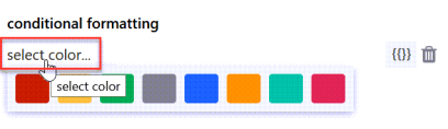
Enter your condition in the field next to the color. You can use the
valueproperty and manipulate it with JavaScript String and Regex APIs. When you click on the mustache picker, you'll get some examples:Value is greater than something, less than something, etc.
For example:
{{value < 10}}(The color you picked will be used if the value is less than 10)Value is present in the result
For example:
value.IndexOf('error') != -1(The color you picked will be used if the string value "error" is present in the results)Value matches one of the regular expressions you defined
For example:
value.match(/healthy|good|up/)(The color you picked will be used if the string values arehealthy,good, orup)
Display:
Here you decide how the color is used:
Tile background Highlight the tile in the color you defined. Text foreground
Display the text in the color you defined. Link options
Allows you to turn the graph item(s) into links. You can either enter plain text to create a fixed link (URL always stays the same) or use dynamic properties to create a dynamic link.
Dynamic links make use of dynamic properties which are inserted as part of the URL. This creates a template URL that will be resolved to an actual URL based on the items properties.
For example, if you want to link to tickets in your ticket system and the format of the URL for tickets in your system is
https://www.my-system/ticket-123, where123is the ticket ID, you can use the dynamic property that contains the ticket ID and enter the dynamic URLhttps://www.my-system/ticket-{{ticketID}}.For scalars, you can only use the dynamic property
valuein dynamic links, which means the link changes when the value of the scalar changes. Since a scalar is just one item, it would also make sense to use a fixed link, for example the link to the website of which you are displaying the response time.For status icon or bars and the rows of a grid, you usually want to use a dynamic link since you get multiple items or rows that represent different things. You can use any of the dynamic properties the mustache picker offers you.
Examples for URLs with dynamic properties for popular APIsDynamic mustache properties and values you need to change according to your instance are highlighted in bold.
ServiceNow incidents:
https://<your-instance>.service-now.com/nav_to.do?uri=%2Fincident.do%3Fsys_id%3D{{sys_id}}PagerDuty incidents:
{{incident.html_url}}Azure DevOps projects:
https://dev.azure.com/<your-instance>/{{name}}Azure DevOps builds:
https://dev.azure.com/<your-instance>/_build/results?buildId={{id}}Zendesk tickets:
https://<your-instance>.zendesk.com/agent/tickets/{{id}}Azure Application Insights
https://portal.azure.com/#@squaredup.net/resource/{{ResourceId}}Click done to save the tile.
The tile now shows data according to your settings.
How to configure a Performance tile Report
Add a new tile to a dashboard or perspective and choose the Performance tile.
Choose the Report visualization.
 About the Report visualization
Allows you to compare metrics, such as two different metrics or metrics over different time periods. For example, compare
Processor TimewithMemory Available, or comparePercentage CPUwith the same period last week.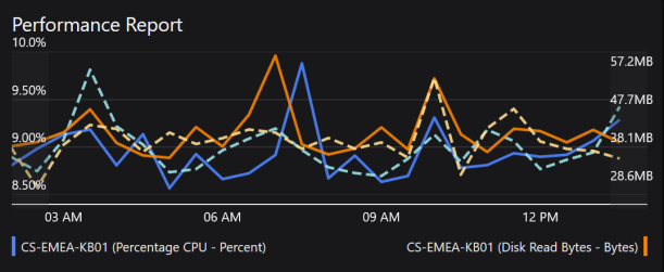
For a step by step guide to using this tile jump to Walkthrough: Adding a Report to compare different metrics and/or time periods..
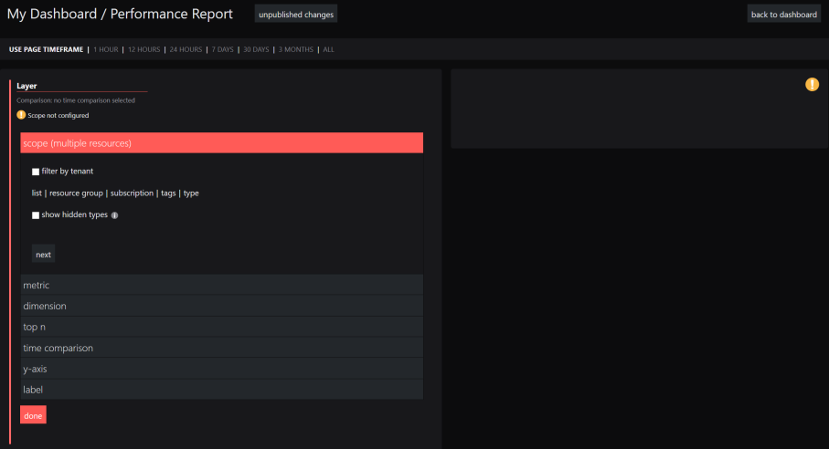
Report editor:
Click on Configure report to switch to the report editor.
In the report editor, you can compare different metrics and time periods with each other:A Layer contains the object and the metric. By adding new layers, you add new metrics and compare them with each other.
Time comparisons compares different time periods of the same metric in the same layer.
Examples:
If you want to compare how one metric looks compared to the same metric six months ago, you only need one layer with a time comparison.
If you want to compare the CPU usage to the memory usage of one computer, you need two layers with different metrics.
Timeframe (at the top of the editor)
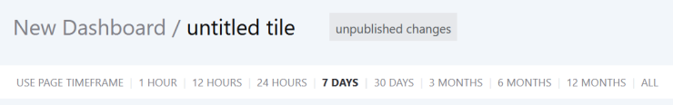
The timeframe section allows you to determine the timeframe for the data. You can choose either to use page timeframe, which allows users viewing the page to change the timeframe on the fly, or for you to set a fixed specific timeframe which will ignore the page timeframe settings.
What is the page timeframe?The page timeframe is the timeframe setting a dashboard
or perspective is currently using. When a user changes the page timeframe, all tiles that use the page timeframe will adapt to the new timeframe. Tiles that don't use the dynamic page timeframe aren't affected and won't change.Dashboard Server automatically uses the highest resolution data available for the time period.
Note: Using the page timeframe can lead to impossible time comparisonsIf your report uses the page timeframe, some page timeframe settings might make it impossible to show a time comparison. The page timeframe must be set to a shorter range than the time comparison.
Example: Your report uses the page timeframe and your time comparison is set to last week (which means 7 days ago from today). When a user changes the page timeframe to last 30 days (which means 30 days ago from today), the time range of the report data is longer than the time comparison.How to identify this issue:
When the comparison line cannot be shown a yellow exclamation mark will be shown at the top right of the tile with a message similar toTimeframe from 5/25/2019 10:26:00 AM to 6/24/2019 10:26:00 AM cannot be shifted by the range 'Last7Days' because it is longer than the range.How to fix this issue:
If you set your report to a specific timeframe, this issue will not occur since the page timeframe will be ignored.Scope
The scope section allows you to define what is shown.
Scope options on dashboardsTip: If you experience any problems with scoping tiles, you'll find FAQs and help in the article How to scope tiles.
Note: By default, results are shown across all subscriptions (unless the subscription option is chosen to specify only one or more subscriptions).
Filter by tenant By default results are shown across all tenants. In Dashboard Server 4.7 and above a user who has access to multiple tenants will see a filter by tenant option.
If you see the message "You do not have access to all of the tenants currently selected" or "Tenant ID could not be resolved"In a multi-tenant environment a user who does not have access to all tenants will see this message if they attempt to edit a scope containing tenants that they do not have access to. This may be because:
- One Dashboard Server admin has added a tile scoped to tenants that other Dashboard Server admins do not have permissions to.
- The customer/tenant is no longer serviced by this Customer Service Provider (CSP), so the tenant has been permanently removed for all Dashboard Server admins.
Symptoms
A tile scope shows:
"You do not have access to all of the tenants currently selected. Click here to reset which will remove those tenants from the scope."
Tenants the user does not have access to show as:
"Tenant ID could not be resolved"
Procedure
The message warns users that they do not have permissions to all the tenants in the scope.
If the user chooses to reset and therefore edit the scope then the tenants that they do not have access to will be removed. If saved this scope will also have those tenants removed for users who do have access to them.
It is not possible for the user to edit the scope without those tenants being removed from the scope.
Where a tenant has been removed permanently you may wish to reset the scope to remove the unresolvable tenants.
List List allows you to select several individual items to show.
You can add multiple
items . To remove anitem click the x to the right of its name.Tip: Start typing and after two characters you'll see suggestions that match the name appear.
Note: It depends on the tile what happens when you select more than one item. For example, when you select two virtual machines for a Status tile, you'll see the status of those VMs individually. When you select two virtual machines for a Cost Management tile, you'll see the cost for the two VMs added together.
Resource group Select one or more resource groups.
Filter by type:
Tick filter by type to only show resources of a particular type within the chosen resource group.
Subscription Select one or more subscriptions from the dropdown box if you wish to restrict results to only one or more subscriptions. When this is not used results are shown across all subscriptions.
Filter by type:
Tick filter by type to only show resources of a particular type within the chosen subscription.
Tags Select items with a particular tag. Add the tag name and the tag value you want to use to search for. If you select multiple tags, the search automatically 'ANDs' the tags which means the scope only contains items which are tagged with all the tags listed.
Filter by type:
Tick filter by type to only show resources of a particular type within the chosen tag(s).
Type Scope type can be used to show all resources of a particular type, for example all databases across all subscriptions, by typing
databasesand selectingSQL databases.Show hidden types This works in the same way as the Show hidden types option in the Azure portal.
Hidden types include some ancillary resources which are created/managed by Azure infrastructure. It might be useful to display these resources when cleaning up your resource groups or subscriptions.
Scope options on perspectivesNote: If you never used a perspective, you should read Working with perspectives before scoping tiles on perspectives.
The power of perspectives is that tiles on a perspective can use a dynamic scope. A dynamic scope considers the currently viewed
resource . A dynamic scope consists of two different states:the configuration of the scope in the tile (for example, "consider child objects of type logical disk for the currently viewed object")
the actual resolved scope that depends on which
resource you are currently viewing ("this object has 5 child objects of type logical disk")
After configuring the dynamic scope once in the tile, you'll get different results depending how the scope is resolved on the different
resources you are viewing.On perspectives, you can scope tiles to:
this resource
(only on perspectives for resources)The tile's scope will be the resolved to the resource that is currently viewed. child resources
(only on perspectives for resource groups and subscriptions)When you select this option, the scope of the tile will be resolved to all resources that are in the group or subscription that is currently viewed.
If you want to narrow the scope down to a specific type of resource in the group or subscription, you can filter for one specific type of resource.
other resources Gives you the normal, non-dynamic scope options you are used to when scoping tiles on dashboards. This means the tile will not dynamically adapt it's content to the currently viewed
resource , it will always show data for the staticresource picked here.Since the power of perspectives is that their tiles can show data for different
resources depending on whatresource is currently being viewed, you should only select this option when you are sure that there is no relationship between the desired scope and the currently viewedresource .Metric
Here you define which value the graph will show. For example, if you want to see the response time of different servers, your metric value would be response time. If you want to see the number of tickets, your metric value would be number (of tickets).
The drop-down list will show you a list of all metrics available for the scope you have set. Press the down arrow on your keyboard in the choose metric field to see the list.
If no metrics are listed and the tile is showing the message
Resources must all be of the same typego to the Scope panel and check that the resources are all of the same type, such asvirtual machines. For example, if you have selected a resource group in the scope you should tick filter by type to ensure that only resources of one type are returned.For more information about metrics available see Azure Monitor Metrics Overview and Supported metrics with Azure Monitor. Dashboard Server does not support metric namespaces. For more information see Azure Monitor Metrics Data Structure.
After you've chosen a metric, you'll see more options:
Interval
Allows you to select the interval at which you would like to see data points. For example, data points a minute apart, 30 minutes apart, or a day apart.Aggregation
Allows you to control how the data is aggregated when using intervals over 1 minute. For example, if using an interval of an hour would you like to the 60 data points collected in each hour to be aggregated together to show you one point for that hour that is the average figure, or the maximum figure.Custom label:
Allows you to specify the metric label.Top N
Here you can define a limit for the number of results you want to see. Activate the limit number of results displayed checkbox to enter a limit for results. You can choose if this limit should be applied from the top ranking results down (ascending, default option) or from the bottom ranking results up (descending).
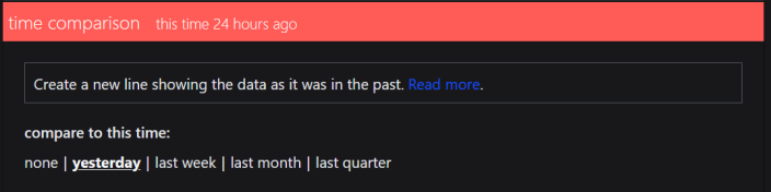
Creates a new line in the graph that shows the same data, but how it looked like in the past. The line will be a dashed line to be easily identifiable as a time comparison. If the line refers to the same object, the lines will be the same color, with the time comparison line in a lighter shade.
You can choose different points in the past between yesterday and 12 months ago. If you don't want a time comparison line in your graph, leave the setting to none (default).
Y-axis
Here you can decide if the values (y-axis) and labels for this layer will be shown on the left or right side of the graph.
If you want to compare two different metrics, it makes sense to put one layer's metrics on the left side and the other layer's metrics on the right side.
Label
auto Choose this option if you want to use the default label that has been created automatically.
custom
Here you can change the label to a custom label. You can use static text and dynamic properties. Use the mustache picker
to select dynamic properties from the response data to use them as labels.For more information see How to use Custom Labels
Important note if you are using external API properties with hyphens for custom labels (Web API tile, Elasticsearch tile, Splunk tile)Property names that contain hyphens (for example
properties.name-with-hyphens) can't be processed due to a JavaScript limitation. If you want to use a property that contains a hyphen, you have two options:If you have access to the data source and can change the name of the property, change the name of the property to a name without hyphens.
For example, if your Elasticsearch query uses a property (an aggregation, a grouping or any other property you want to use) with a name that contains a hyphen, you can either access your Elasticsearch instance and change the name there or you can overwrite the name in the query dsl field.
If you can't change the name of the property, you need to enter the property name in the following format:
Original property name:
{{properties.name-with-hyphens.value}}New format:
{{properties['name-with-hyphens'].value}}
Click back to dashboard in the upper left corner to get back from the report editor to your dashboard.
If you want to define further settings for your report, you need to switch the dashboard to edit mode and edit the tile.
Timeframe:
There is only one timeframe for the report and it can be controlled from two different places, here and in the report editor. If you change the timeframe here, the timeframe in the report editor changes. If you change the timeframe in the report editor, the timeframe changes in this panel.
The timeframe section allows you to determine the timeframe for the data. You can choose either to use page timeframe, which allows users viewing the page to change the timeframe on the fly, or for you to set a fixed specific timeframe which will ignore the page timeframe settings.
What is the page timeframe?The page timeframe is the timeframe setting a dashboard
or perspective is currently using. When a user changes the page timeframe, all tiles that use the page timeframe will adapt to the new timeframe. Tiles that don't use the dynamic page timeframe aren't affected and won't change.Note: Using the page timeframe can lead to impossible time comparisonsIf your report uses the page timeframe, some page timeframe settings might make it impossible to show a time comparison. The page timeframe must be set to a shorter range than the time comparison.
Example: Your report uses the page timeframe and your time comparison is set to last week (which means 7 days ago from today). When a user changes the page timeframe to last 30 days (which means 30 days ago from today), the time range of the report data is longer than the time comparison.How to identify this issue:
When the comparison line cannot be shown a yellow exclamation mark will be shown at the top right of the tile with a message similar toTimeframe from 5/25/2019 10:26:00 AM to 6/24/2019 10:26:00 AM cannot be shifted by the range 'Last7Days' because it is longer than the range.How to fix this issue:
If you set your report to a specific timeframe, this issue will not occur since the page timeframe will be ignored.Data range:
The Data Range option allows you to choose the range of data the graph will display. For line graphs, this means the data on the y-axis.
percentage Shows 0 to 100 fit to data Shows the data minimum to data maximum fit to data (from zero) Shows from 0 to the data maximum custom Allows you to specify the min and max custom fit Allows you to specify the min and max limits, so that data outside your settings will not be shown. If all the data falls within your specified ranges then the y-axis range will fit to the data rather than your caps.
Height:
Height: Allows you to set the height of the tile with a slider.
Legend:
Allows you to show or hide the legend of the graph.
Click done to save the tile.
The tile now shows data according to your settings.
How to enable graph color matching
Graph color matching means that one item (a specific resource, object, site, anything you are displaying in your graphs) is shown in the same color in different graphs on one dashboard
Line Graphs, Bar Graphs and Reports (available in Performance tiles) support graph color matching.
Color matching only works when the item uses the exact same label in all graphs.
For Dashboard Server v4.8 and above:
Graph lines on a dashboard will show the same color when the object labels match, even if those graphs show different metrics.
For Dashboard Server v4.7 and below:
Graph lines will only show the same color for the same object when displaying the same metric.
How to use graph color matching
Graph color matching must be enabled for the dashboard
or the perspective . The default setting for all dashboardsand perspectives is color matching enabled.How to check or change the color matching settingThe default setting for graph color matching is on. Here's how you can check or change this setting:
On a dashboard or perspective click the edit button

Click the settings button.
The match by label button is under Graph colors.
If you want to disable color matching, toggle the match by label button to OFF.
If you want to enable color matching, toggle the match by label button to ON.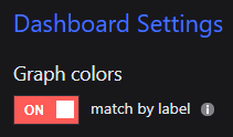
The label for the item must be the same in all graphs that you want to display the same color.
How to ensure labels match across different graphsIn the label panel of your graph, set the label to custom label.
If you are using a mustache property, make sure that you use the same property in all graphs you want to color match.
If you are using a manipulated mustache label (for example, custom text between labels like
Name: {{properties.name}}), make sure to use the exact same label in all graphs you want to color match.If you are using custom text, make sure to use the exact same custom text including upper and lower cases.
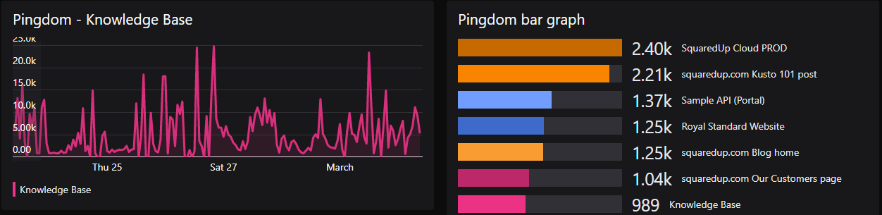
For resources that show the same label the colors will now match:
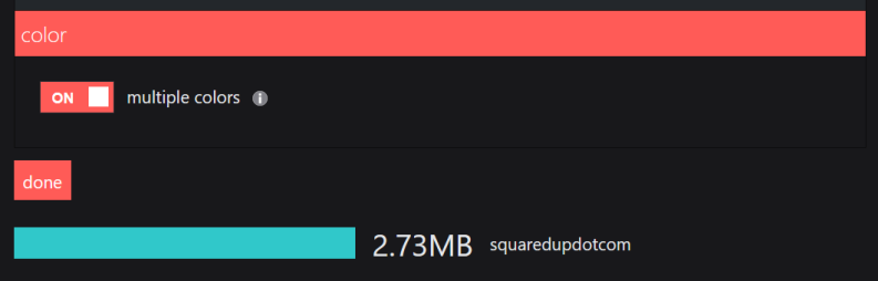
For Bar Graphs (called Bar Top N in Performance tiles), you need to switch on multiple colors to enable color matching. Multiple colors is switched off by default, you need to switch it on for each Bar Graph.
How to switch on multiple colors for Bar Graphs (called Bar Top N in Performance tiles)Go to the color panel of your Bar Graph.
Toggle multiple colors to on.
Bar Graphs will now color match, as long as the dashboard setting match by label is on and the labels do match.
Walkthroughs
Walkthrough: Adding a Line Graph to show % Processor Time.
In Dashboard Server navigate to where you'd like the dashboard to be created. Hover over the + button and click dashboard.
Give the dashboard a title, by replacing the text that says New Dashboard.
The dashboard is saved as you go along so there's no need to save your changes. You can find your dashboard by clicking on the right-hand menu ☰ > system > unpublished.
A new tile has already been added to the dashboard. Edit the title by overwriting the placeholder value New tile with your own title.
The tile selector will already be open. Click Performance. The Performance tile button (along with several other tiles) displays a little plus up the top right. This indicates that there are more tiles available from this one button.

Click on the Line Graph button to create a line graph.
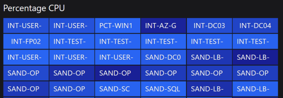
Next we need to scope the tile. In the scope section select type then start typing
Virtual machinesand then click onvirtual machinesfrom the results.Correctly scoping the tile is very important. For more information see How to scope tiles
Click next.
In the metric box type
cpuand then selectPercentage CPUfrom the results.A line graph for the processor usage should now appear. You could stop here, but we'll continue to configure the tile.
Change the interval to 15 minutes.
Change the aggregation to maximum.
Skip the dimension section, as this metric does not have any dimensions.
Leave the Timeframe set to use page timeframe so the time period for this tile changes when users change the page timeframe.
Click next.
In the top n section limit the number of results displayed to 3, and tick descending to show those with the highest processor utilization.
Leave data range as it is.
Leave the display as it is.
In the label tick show legend
Click done.
Walkthrough: Adding a Heatmap to show % Processor time and Logical Processors.
- Click the orange + plus button to add a new tile to the dashboard.
Click Performance, and then the Heatmap button.
Next we need to scope the tile. In the scope section select type then start typing
Virtual machinesand then click onvirtual machinesfrom the results.
Correctly scoping the tile is very important. For more information see How to scope tilesIn the metric box type
cpuand then selectPercentage CPUfrom the results.A heatmap should appear after a moment.
- Once you've chosen a metric give the tile a title which explains what the tile shows.
Skip the dimension section, as this metric does not have any dimensions.
In the display section adjust the width and height sliders to change the heatmap sizes.
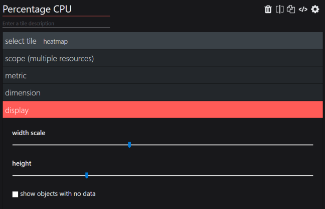
By default objects with no data are hidden, you can choose to show them by ticking the box show objects with no data.
- The color section allows you to change the heatmap color.
- Leave the data range section as it is for now. This allows you to change the range of values shown.
- Leave the label section as it is. For more information on changing the label see How to use Custom Labels.
Click done.

Walkthrough: Adding a Report to compare different metrics and/or time periods.
This walkthrough shows you how to add metrics as layers to the Report tile, and also how to compare them with historical data.
Click on the Report button to create a Report.
Give the tile a title.
The Report tile uses layers to allow you to add multiple metrics to one graph for comparison. This could get difficult to view in a narrow column, so this tile allows you to edit the tile full screen in a report editor). Click configure report to open the report editor and add layers.
The report editor has opened full screen, but you can return to your dashboard at any time by clicking the back to dashboard button at the top right. The layer configuration appears on the left side of the screen, and a preview of the graph will show on the right as your proceed.
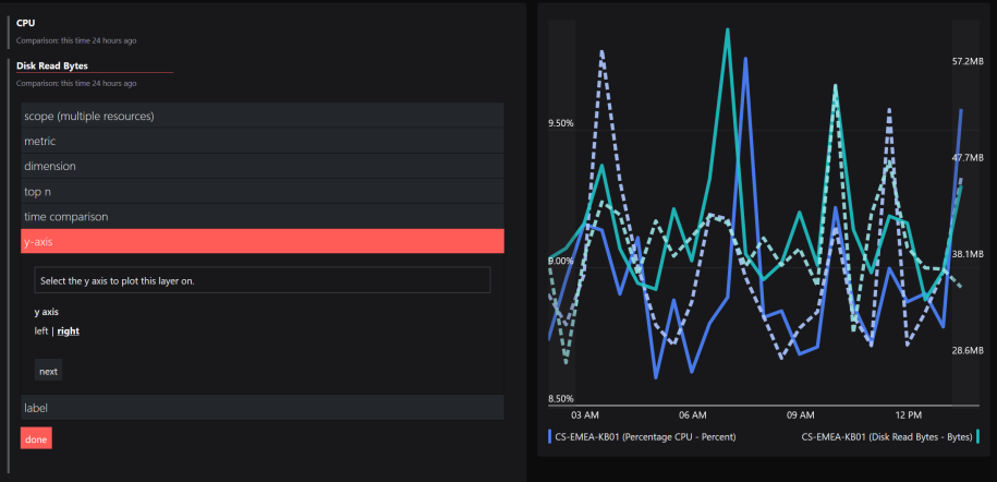
The first layer is expanded ready for you to edit. Give the layer a title, such as the metric you intend to add.
For this walkthrough we are going to compare two metrics for one machine. In the scope section click list then type the name of a machine, and then click on that machine in the results.
In the metric > quick find box type the name of the first metric you want to add.
For this walkthrough type
CPUand then select the metricPercentage CPU.The right side of the screen will show a preview of the graph. You could stop here, but we'll continue to configure the tile.
Click done.
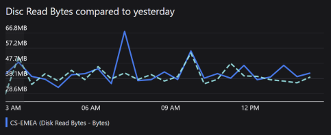
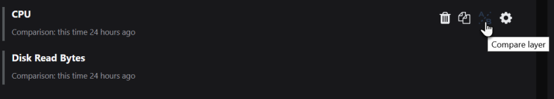
Click the orange plus button to add a second layer for your next metric.
Give this layer the title of the metric you are adding.
Click list then type the name of machine you used for the first layer, and then click on that machine in the results.
In the metric > quick find box type the name of the first metric you want to add.
For this walkthrough type
diskand then select the metricDisk Read Bytes.Skip the dimension section, as this metric does not have any dimensions.
Leave the top n section as it is for this walkthrough.
You might like to add a line to allow you to compare this data with historical data. Adding the time comparison is optional.
In the time comparison section click one of the time periods to compare with this data, for example click yesterday.

To add a time comparison for the existing layer, hover over the existing layer and then click the compare layer button to jump straight into the time comparison section and then click yesterday.
In the y-axis section click on right to get the Disk read bytes graph to use the right-hand y-axis.
This is useful because the two metrics use quite different scales, so the two graphs show more clearly using two different y axes.
At this point the graph is complete, so you can click done and then the back to dashboard button up the top right of the page.
Return to editing the Report tile by clicking the edit this dashboard button at the top right, and then the edit tile button to the top right of the tile itself.
Click into the legend configuration section and click on show legend to tick the box.
Click done.

FAQs
Why are no metrics listed?
If no metrics are listed and the tile is showing the message Resources must all be of the same type go to the Scope panel and check that the resources are all of the same type, such as virtual machines. For example, if you have selected a resource group in the scope you should tick filter by type to ensure that only resources of one type are returned.
How do I get the line colors to match for the same objects on different graphs?
Ensure that the labels match, jump to How to use the Performance tile.